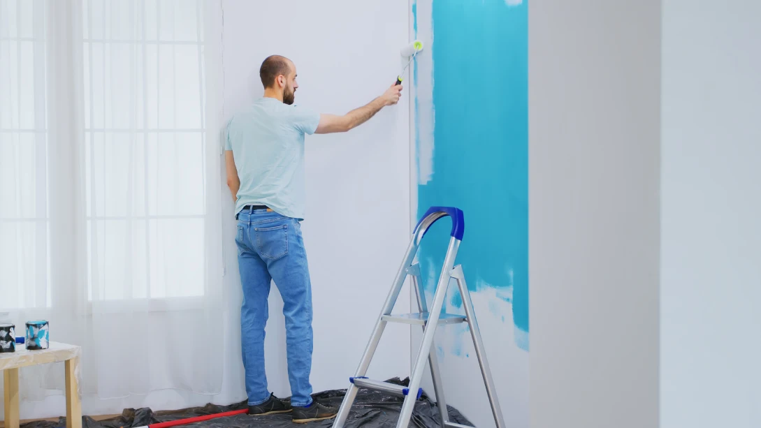
As we move into 2025, it’s the perfect time to think about giving your home a little refresh. One of the easiest and most impactful ways to transform any space is through paint. Whether you’re in Abbotsford or anywhere else, the colors you choose can change the vibe of your home without the hefty price tag of a full renovation. After all, who doesn’t love the idea of a fresh start, especially when it’s as simple as changing up your interior paint?
In this blog, we’ll take you through the hottest interior paint colors for 2025, giving you the inspiration you need to start your own transformation. But before that, let’s delve into why choosing the right paint color is so important.
Why The Right Paint Color Matters?
Choosing the right paint color for your home can be more than just a visual update; it’s an investment in the feeling and atmosphere of your home. A carefully chosen color palette can brighten up your space, create a relaxing environment, or even make your rooms feel bigger and more inviting. If you’re looking to increase your home’s value or simply bring it into the 21st century, updating your walls with the latest color trends is a great first step.If you’re wondering where to begin, interior painters in Abbotsford can help you choose the right shades that not only reflect your personality but also complement the existing elements in your home. Whether it’s a modern look or a timeless feel, professional house painters in Abbotsford have the expertise to guide you through this exciting transformation.
2025’s Trendiest Paint Colors
1. Soft Earthy Tones: Nature Is In
The shift toward calming, earthy tones is stronger than ever in 2025. Soft shades of terracotta, clay, and muted greens are gaining major popularity. These colors mimic the natural beauty surrounding us—especially in places like Abbotsford, where lush greenery and rural landscapes are so prominent. Think of these tones as a way to bring the outdoors in.
Why choose earthy tones?
Not only do they create a grounded, cozy feel, but they also pair well with a variety of décor styles. From mid-century modern to farmhouse chic, these colors allow your furniture and artwork to stand out without clashing. For a truly timeless and calming space, opt for light terracotta on your walls or a deep olive green as an accent wall. The result? A soothing, earthy palette that invites warmth into your home.
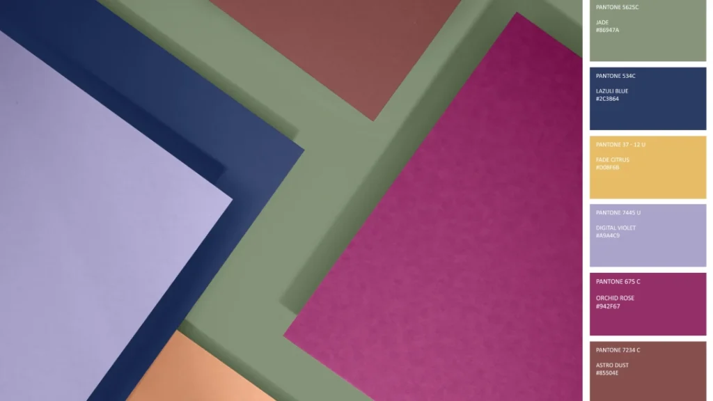
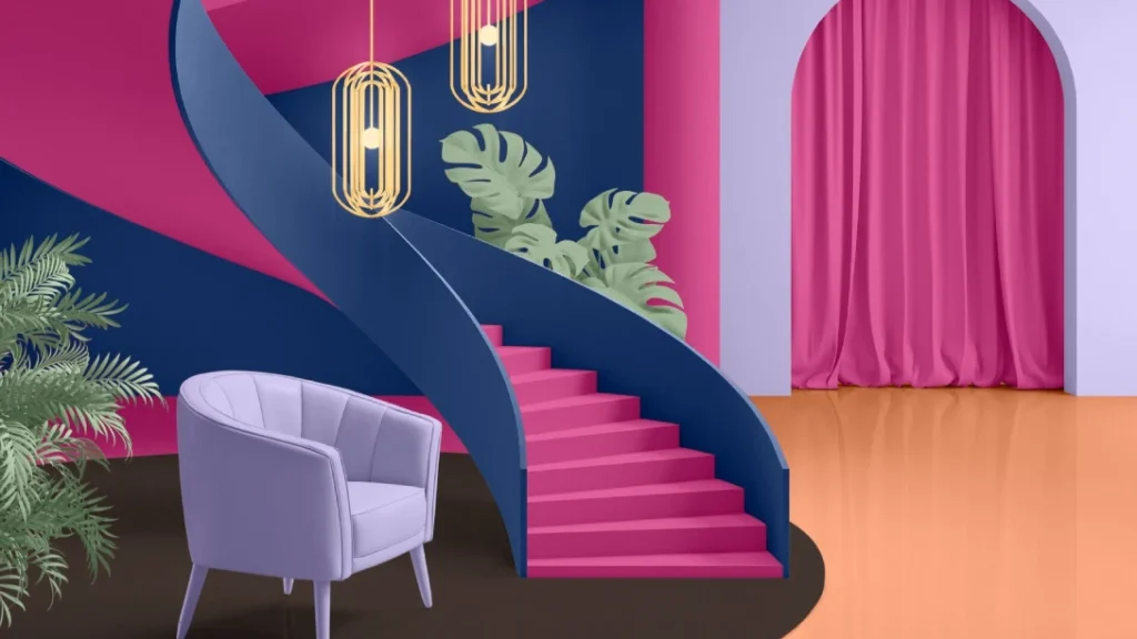
2. Bold Blues: A Pop Of Personality
2025 is also embracing bold, statement-making colors—none more so than striking shades of blue. From deep navy to electric cobalt, blue is making a comeback as an interior powerhouse. If you’ve been hesitant about introducing a bold color, now’s the time to take the plunge.
Why choose bold blues?
Blues are versatile. They can evoke tranquility in bedrooms or add an element of sophistication in living rooms. Pair a bold navy with gold or brass accents for a luxe look, or use a brighter blue to energize a more neutral room. In Abbotsford, where the sky often stretches out in stunning shades of blue, this color can be a lovely way to reflect that outdoor beauty in your interior spaces.
3. Warm Neutrals: Never Underestimate The Power Of Beige
If you’re looking for something subtle yet elegant, warm neutrals like beige, taupe, and soft ivory are the way to go in 2025. While these tones may have once been labeled as “boring,” they’re making a strong comeback in the most stylish of ways. Warm neutrals are the perfect backdrop for your furniture, art, and personality to shine through.
Why choose warm neutrals?
These hues help create a calm, relaxing environment—ideal for those who appreciate simplicity but still want a space that feels chic and inviting. Pair warm neutrals with pops of color in your décor to avoid the space feeling flat. As an added bonus, these colors are timeless, making them an investment that’ll remain fresh for years to come.
4. Moody Charcoals And Black: Sophistication With An Edge
If you’re ready to embrace something more dramatic, 2025 is bringing back moody charcoals and blacks. These deep hues have evolved from being an accent color to a dominant choice for feature walls and even entire rooms.
Why Choose Moody Charcoals And Black?
Moody tones bring sophistication and boldness to any room. A charcoal-grey living room or a black-accented bedroom can make your home feel ultra-modern and high-end. Pair with metallics, glass, or matte finishes to keep the space from feeling too heavy. It’s a daring choice but one that makes a bold statement.
5. Soft Pastels: A Touch Of Whimsy
On the lighter end of the spectrum, soft pastels are still going strong in 2025. Think blush pinks, muted lavender, and pastel yellows. These hues are perfect for creating light, airy spaces that still feel inviting.
Why choose soft pastels?
These colors are ideal for bedrooms, nurseries, or spaces where you want to maintain a light and uplifting atmosphere. Pastels also complement a variety of other tones—whether paired with wood finishes, metallics, or vibrant décor, they never overwhelm the space.
Bring Your Vision To Life With Dreamscape Painting Ltd.
Choosing the right color is only the beginning, but having the right team of house painters in Abbotsford, like Dreamscape Painting Ltd., ensures your project is completed to perfection. Our skilled painters have the expertise to bring your chosen shades to life, ensuring a high-quality finish that enhances your home’s atmosphere. Whether you’re looking for earthy tones to create a grounded vibe or bold blues to make a statement, we have you covered.
Get in touch with us to start your transformation today. Let us help you create the perfect ambiance that suits your style and enhances your living space!