

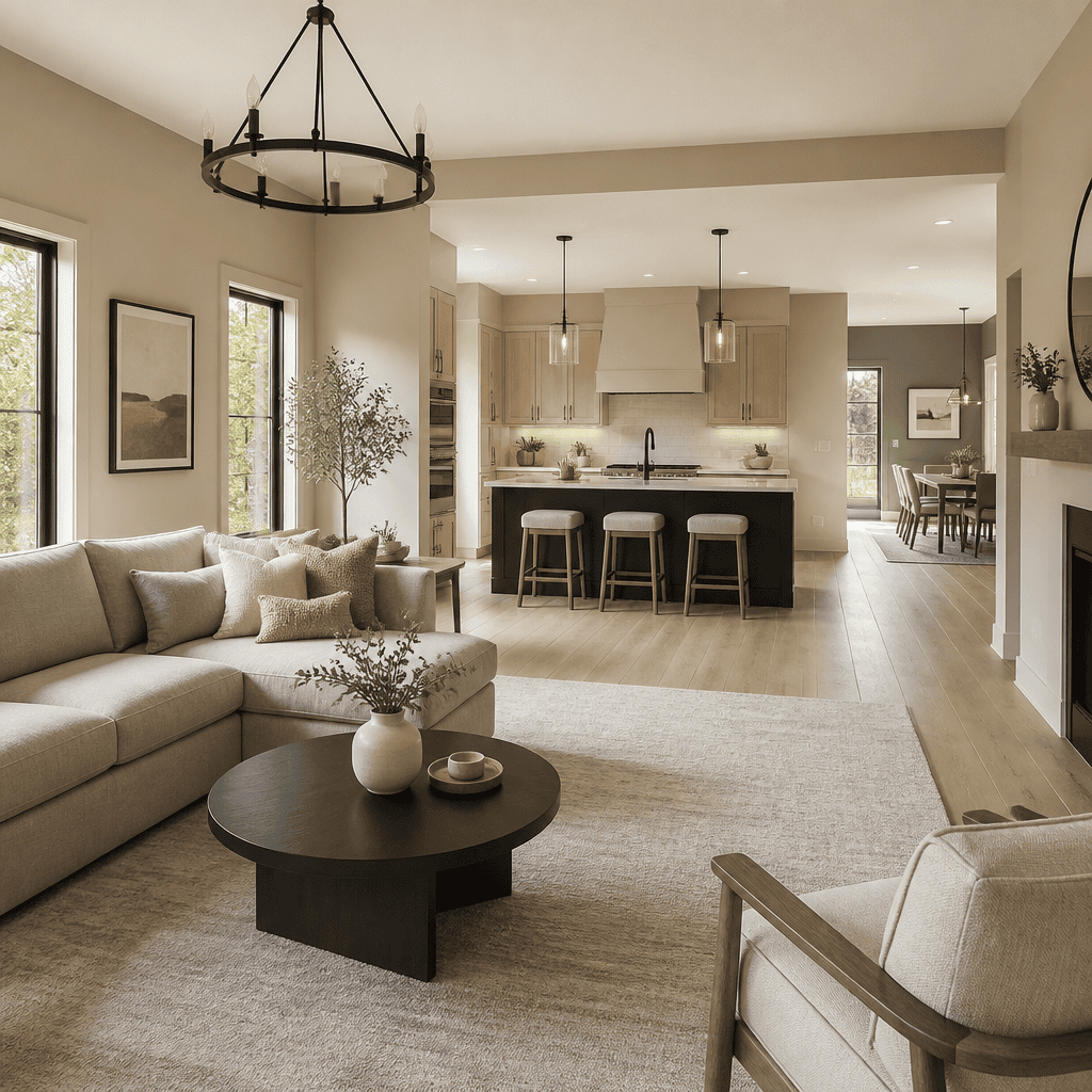
Most homeowners pick colours room by room, then wonder why their open-concept home feels like a patchwork quilt. The problem is not the colours themselves. The problem is treating a connected space like a series of isolated boxes. A proper interior paint colour guide for open-concept living starts with a completely different mindset: you are painting one visual experience, not four walls at a time. Get this right, and every sightline in your home flows naturally. Get it wrong, and even expensive paint looks like a mistake.
Table of Contents
- Quick Takeaways
- Why Open-Concept Homes Demand a Different Colour Strategy
- Understanding Undertones: The Real Reason Colours Clash
- Building Your Open-Concept Colour Palette Step by Step
- Open-Concept Paint Colour Approaches Compared
- How Light Direction Changes Every Paint Decision
- Interior Painting Tips for Homeowners Tackling Large Spaces
- When to Call a Professional Painter in the Lower Mainland
- Frequently Asked Questions
- References
Quick Takeaways
| Key Insight | Explanation |
|---|---|
| Anchor your palette with one dominant neutral | One neutral used on 60-70% of visible wall space creates cohesion across sightlines in open-concept layouts. |
| Undertones matter more than hue | A beige with a pink undertone will clash with a grey that has a blue undertone, even if both look neutral on the chip. |
| Test paint in swatches of at least 12 inches by 12 inches | Small chips lie. Large swatches on your actual walls, observed under morning and evening light, reveal the true colour. |
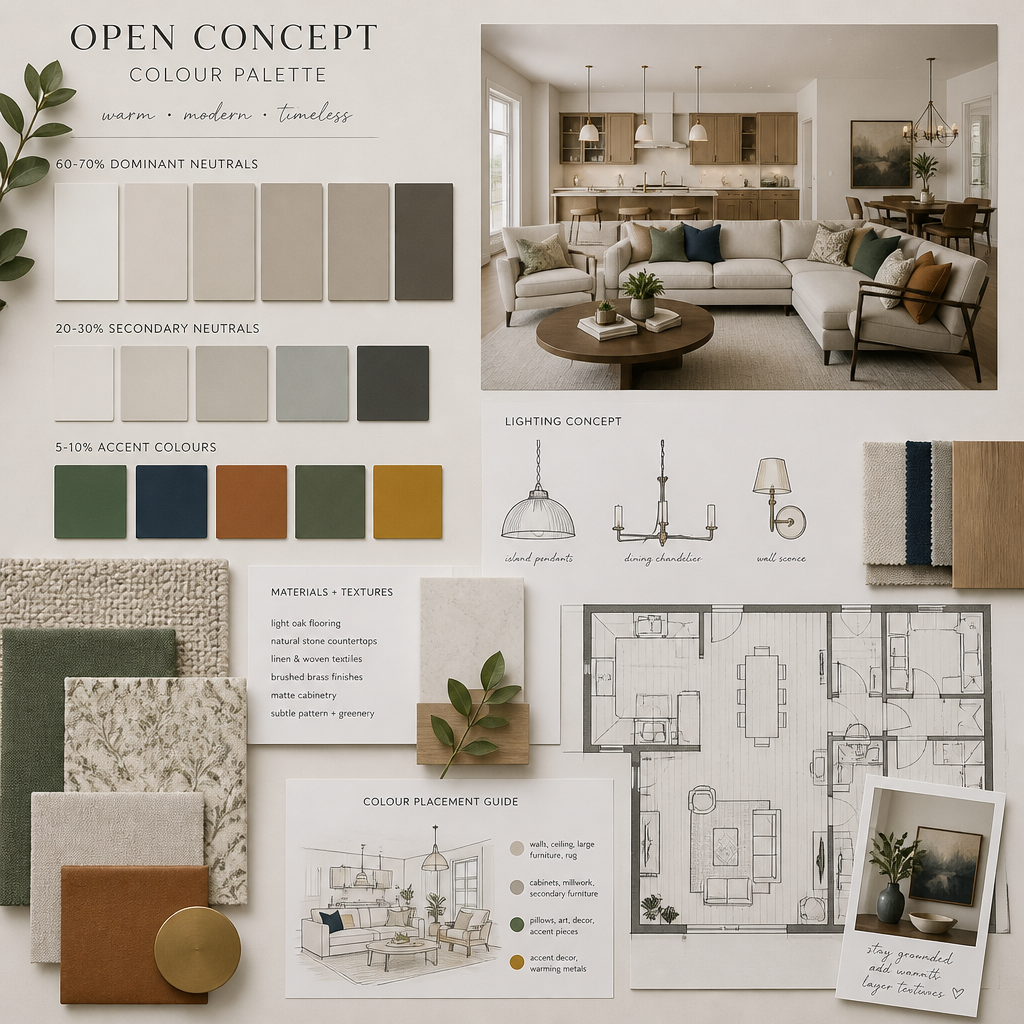
| Use the 60-30-10 rule | 60% dominant colour, 30% secondary colour, 10% accent. This ratio prevents visual chaos across connected rooms. |
| Ceiling colour is not optional decoration | A ceiling painted slightly lighter than the walls in the same colour family raises perceived height and unifies open spaces. |
| Natural light varies by region | Homes in the Fraser Valley and Lower Mainland receive cooler, overcast light for much of the year, which shifts warm tones grey and amplifies cool tones. |
| Transition zones need deliberate colour treatment | Hallways and stairwells connecting open zones should carry the dominant colour, not introduce new ones. |
Why Open-Concept Homes Demand a Different Colour Strategy
In a traditional floor plan with doors between every room, each space is a self-contained visual unit. You can paint the dining room deep teal and the living room warm white and nobody is the wiser, because a door and a wall frame the transition. In an open-concept home, those frames are gone. The kitchen, dining area, and living room exist in one continuous sightline, sometimes stretching 40 feet or more.
This means that choosing open concept paint colours is fundamentally an exercise in long-range visual planning. When you stand at your kitchen island, you are simultaneously seeing the living room accent wall, the dining nook, and possibly a hallway. If those areas have competing colours, the eye has nowhere to rest.
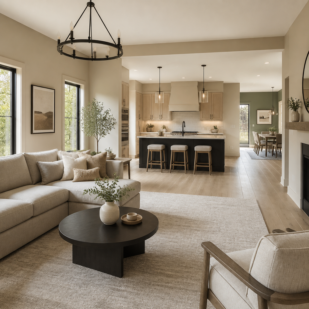
In practice, the most common mistake we see in Lower Mainland homes is picking a favourite colour for the main living area, then trying to introduce contrast by choosing something dramatically different for the kitchen or dining zone. The intent is to define each area. The result is visual noise. The better approach is to define zones through finishes, furniture, and lighting, while keeping paint colours within a tightly controlled family.
Understanding Undertones: The Real Reason Colours Clash
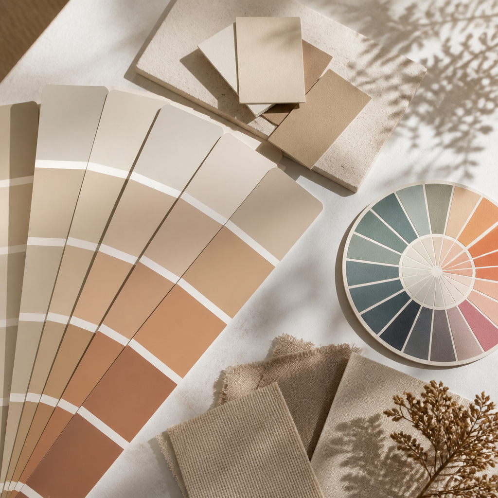
Walk into any paint store and the neutrals section looks safe. Beige, greige, warm white, soft grey. But two beiges sitting side by side in a connected space can look like entirely different colours, because one carries a yellow undertone and the other carries a pink one. This is the single most misunderstood concept in residential colour selection.
How to Read an Undertone Before You Buy
Hold the paint chip against a pure white surface. The undertone becomes visible almost immediately. A colour that looks beige against other chips may reveal a distinctly pink or orange cast against white. Do this test with every colour you are considering before committing to a gallon.
In a connected open-concept space, all your chosen colours need to share a consistent undertone family. If your dominant neutral has a warm yellow-brown undertone, your accent colour should also lean warm. Mixing cool and warm undertones across sightlines creates a tension that reads as poor planning, even if a homeowner cannot name exactly what feels off.
The Specific Undertones That Work in Fraser Valley Homes
Because the Lower Mainland and Fraser Valley receive predominantly cool, overcast daylight for a significant portion of the year, warm undertones in the yellow, caramel, and terracotta families tend to perform well. They read as intended warmth under grey skies rather than appearing dull. Cool greys with blue undertones, while popular in brighter climates, can feel cold and clinical in a Langley or Abbotsford home during October through March.
Pro tip: Take three paint chip candidates home and tape them directly to your wall. Observe them at 8 a.m., at noon, and at 7 p.m. with your interior lights on. The colour that holds up across all three conditions is the right choice for your home.
Building Your Open-Concept Colour Palette Step by Step
Building a palette is a sequential process. Skipping steps is how homeowners end up repainting the same wall three times. The sequence below is the one we recommend to every client before a single drop of paint is purchased.
Step 1: Start with Your Fixed Elements
Flooring, countertops, cabinetry, and large furniture pieces are not changing. Your paint palette must respond to these fixed elements, not ignore them. Pull the dominant and secondary colours from your flooring first. If you have medium-toned oak floors, your paint options immediately narrow to colours that complement warm wood tones.
Step 2: Choose Your Dominant Neutral
This is the colour that will cover the majority of your wall surface. It should be versatile enough to read well in both natural and artificial light, and it must share an undertone with your fixed elements. This is not the exciting part of the process, and that is fine. A strong dominant neutral is what makes everything else look intentional.
Step 3: Select One Secondary and One Accent Colour
The secondary colour will appear on roughly 30% of surfaces. This might be a feature wall in the dining area, a painted kitchen island, or a hallway. The accent, at 10%, is for trim, a single architectural element, or a statement piece like a built-in bookcase. Three colours maximum for most open-concept homes. Four is pushing it. Five is almost always a mistake.
“Colour is not applied to a surface. It is applied to a context. The same blue that looks serene in a showroom can feel oppressive in a north-facing room with eight-foot ceilings.” – Donald Kaufman, architectural colour consultant and author of Color and Light
Step 4: Account for the 60-30-10 Ratio Across the Entire Floor Plan
Walk through your open-concept space and calculate rough percentages of visible wall area. The dominant neutral should cover 60-70% of total wall area visible from the central sightline. If your kitchen has dark upper cabinets taking up wall space, you have less painted surface there, which changes the overall calculation. Map this before purchasing.
Open-Concept Paint Colour Approaches Compared
There are three distinct strategies homeowners use when selecting open concept paint colours. Each has specific strengths and failure points. The table below compares them honestly.
| Approach | Best For | Common Failure Point |
|---|---|---|
| Monochromatic palette (one colour in varying depths) | Modern, minimalist homes with strong architectural features and consistent lighting throughout | Can feel flat or institutional without contrast from furniture and textiles to break it up |
| Analogous palette (colours adjacent on the wheel: e.g., warm beige, soft terracotta, muted gold) | Traditional and transitional home styles common in Abbotsford and Surrey neighbourhoods | Undertone mismatches between adjacent colours create muddy transitions at room borders |
| Neutral anchor with one bold accent zone | Homeowners who want personality without risk. Works well in connected kitchen-living spaces | The bold accent area is often oversized, making it dominate instead of punctuate the space |
In practice, the analogous palette approach delivers the most consistently satisfying results in the kinds of homes we paint across Langley, Surrey, and the broader Fraser Valley. It creates warmth, allows for personality, and holds together across the natural light variations common in this region. The monochromatic approach requires near-perfect execution to avoid looking sterile.
How Light Direction Changes Every Paint Decision
The same paint colour can look four different ways depending on which direction a room faces. This is not a matter of opinion. It is basic physics. Paint professionals account for light direction before recommending any colour, and homeowners making DIY colour decisions routinely skip this step.
North-Facing Rooms and Open Zones
North-facing spaces receive cool, indirect light throughout the day. Cool-toned greys and blues will look even cooler here, often reading as cold or stark. Warm whites, soft creams, and colours with yellow, peach, or caramel undertones counteract the cool light and feel balanced. In a north-facing open-concept home in Abbotsford or Langley, avoid the trendy cool greige palettes unless you want an unintentionally clinical result.
South and West-Facing Rooms
South and west-facing spaces receive warm, direct light for much of the day. Warm paint tones can become intensified and almost orange in afternoon sun. In these spaces, slightly cooler neutrals perform better because the warm light brings them back toward balance. A colour that looks perfect in a showroom under artificial light may read as pumpkin-adjacent on your west-facing wall at 4 p.m.
Pro tip: For open-concept homes where one zone faces north and another faces south within the same sightline, choose a colour that reads neutrally in both conditions. Test your shortlisted colours on both walls before making a final decision. This is non-negotiable in larger open floor plans.
Interior Painting Tips for Homeowners Tackling Large Spaces
Whether you are painting yourself or preparing for a professional job, understanding the mechanics of painting open-concept spaces prevents costly errors. These interior painting tips for homeowners are specific to connected, large-format spaces, not generic painting advice.
Paint All Connected Walls in One Session
Colour batches can vary slightly between cans, even in the same colour and finish. If you paint the kitchen side of your open-concept space this weekend and the living room side next month, even a minor batch variation will be visible where the two painted sections meet. For large open areas, buy all required paint at the same time and mix cans together before starting.
Finish Choices Affect Colour Perception
Eggshell and matte finishes absorb light and make colours read truer to the chip. Satin finishes reflect light, which can slightly shift warm tones toward yellow and cool tones toward blue in bright conditions. Using the same colour in two different finishes on adjacent surfaces in an open-concept space creates a visible inconsistency. Decide on one finish family for all main wall surfaces in connected zones and stick to it.
Trim Colour Has More Influence Than Most Homeowners Expect
In an open-concept space with long sightlines, trim runs continuously across a large visual field. Bright white trim makes adjacent wall colours look slightly more saturated by contrast. Off-white or cream trim softens the overall palette and works better with warm-toned walls. The trim colour is not a secondary decision. It is part of the core palette and should be selected alongside the wall colour, not after.
When to Call a Professional Painter in the Lower Mainland
Not every paint job requires professional involvement, but open-concept homes are one of the cases where it often makes sense. The scale of connected spaces, the precision required at transitions and trim lines across long uninterrupted walls, and the cost of a colour mistake in a space with 600 or more square feet of visible wall surface all shift the calculus toward professional help.
Dreamscape Painting Ltd. has been serving homeowners across the Lower Mainland since 1990, and open-concept interior painting is one of the most common projects we handle. Our estimators walk through colour selection with clients before recommending any finish or sheen level, because the right colour applied in the wrong finish is still a problem. We also work clean, which matters when furniture and flooring are already in place in lived-in homes.
If you are in Abbotsford, Langley, Surrey, or anywhere in the Fraser Valley and you are staring at paint chips wondering which beige is actually the right beige, that is exactly the kind of decision that benefits from a trained set of eyes and 35 years of local experience. A professional colour consultation before a project begins costs far less than repainting a room because the colour felt wrong after the first coat dried.
The other reason to work with an established local contractor rather than a national one-day paint franchise is the depth of preparation work. A rushed job on an open-concept home skips the priming, patching, and proper cut-in work that keeps colour transitions clean across 40-foot sightlines. That kind of shortcut is visible every time you walk into the room.
Frequently Asked Questions
How many colours should I use in an open-concept home?
Three colours is the practical maximum for most open-concept floor plans. One dominant neutral covering 60-70% of wall surface, one secondary colour at roughly 30%, and one accent at 10%. Going beyond three colours almost always creates visual fragmentation across connected sightlines, which is the opposite of what open-concept design is meant to achieve.
Do I need to use the same paint colour throughout an open-concept space?
Not necessarily, but all colours in the space must share the same undertone family. You can use a slightly deeper version of your dominant colour in the dining zone to visually define that area, but introducing a colour with a different undertone creates a jarring transition. Same undertone family across all zones is the rule, not the same specific colour.
What is the best paint colour for a small open-concept apartment in the Lower Mainland?
For smaller connected spaces, a warm white or soft off-white with a yellow or cream undertone performs consistently well in Lower Mainland homes. It reads as bright without being stark, expands perceived space, and works under the cooler natural light typical of the region. Avoid pure bright white, which can look clinical and amplifies every imperfection on older plaster or drywall surfaces.
Should I paint my kitchen the same colour as my living room in an open-concept layout?
Yes, the dominant wall colour in both zones should typically match or be from the same tone family. The kitchen and living room share a sightline in most open-concept homes, and a dramatic colour shift between them reads as unplanned. You can differentiate the kitchen through cabinet colour, tile backsplash, or pendant lighting instead of wall paint colour.
How do I test paint colours before committing to a full room?
Paint large swatches, at minimum 12 inches by 12 inches, directly on the wall in the actual room. Observe those swatches at three different times of day: morning natural light, midday, and evening under your artificial lights. Small chips under store lighting are nearly useless for predicting how a colour will perform in your specific home. Several paint brands also offer peel-and-stick large-format samples specifically designed for this purpose.
What paint finish should I use for open-concept main living areas?
Eggshell is the standard recommendation for main living areas in open-concept homes. It is washable enough for high-traffic connected spaces, resists marking better than flat or matte, and does not reflect enough light to shift colour perception the way satin does. Reserve satin for trim and semi-gloss for doors and high-contact surfaces.
If you have recently tackled an open-concept colour project or are in the middle of choosing a palette for your Lower Mainland home, share what approach worked for you or what surprised you most about the process.
References
- Forbes coverage of home renovation trends and interior design investment value
- Statista data on home improvement spending and paint industry market size in North America
- Houzz research on homeowner renovation decisions and colour preferences in residential interiors
- Architectural Digest guidance on colour theory and open-concept interior design principles
- Better Homes and Gardens practical resources for choosing interior paint colours and palettes

