

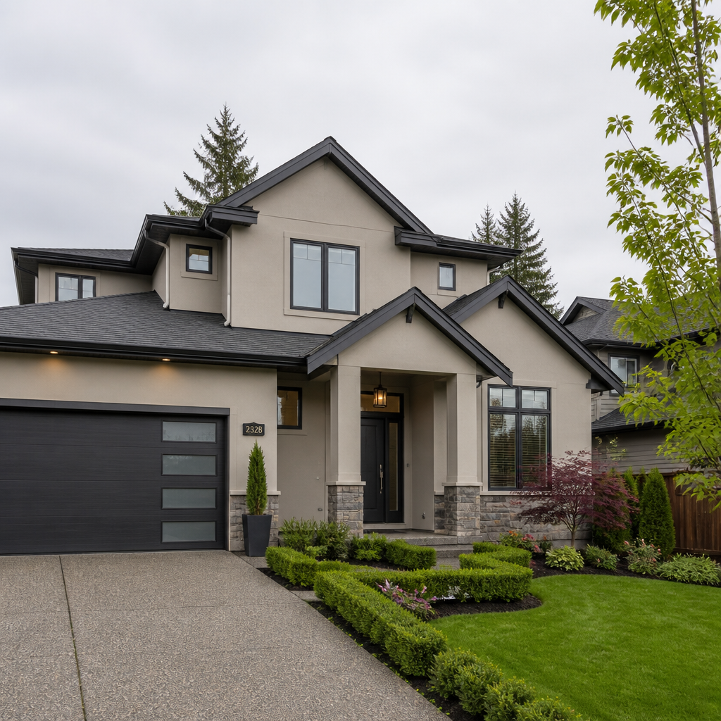
Pick the wrong exterior paint colour on a Lower Mainland home and you are not just making a cosmetic mistake. You are quietly signalling to every prospective buyer, neighbour, and passerby that the property has not been looked after. Exterior paint colours in the Lower Mainland carry more weight than most homeowners realize because this region’s wet winters, overcast springs, and bright summer light make colours behave differently here than they do in sunnier or drier climates. A shade that photographs beautifully on a home in California reads as flat and muddy on a south Surrey house under November cloud cover. Getting this right matters practically as well as aesthetically. A quality exterior repaint is consistently among the highest-return home improvement projects available to BC homeowners, and the colour choice is the decision that determines whether that investment pays off or costs you at resale.
Table of Contents
- Quick Takeaways
- Why Colour Choice Matters More in BC
- Top Exterior Paint Colours for Lower Mainland Homes
- Curb Appeal Painting Surrey: Neighbourhood by Neighbourhood
- Home Value Exterior Painting: What the Numbers Say
- Colour Strategy Comparison: Safe, Trending, and Bold
- Common Exterior Colour Mistakes to Avoid
- How to Choose the Right Palette for Your Specific Home
- Frequently Asked Questions
- References
Quick Takeaways
| Key Insight | Explanation |
|---|---|
| Warm greys and greige tones dominate the Lower Mainland | Mid-tones hide biological staining and grime from heavy rainfall better than very light or very dark shades, and they hold their appearance through BC’s wet seasons. |
| Undertones shift dramatically outdoors | A beige that looks perfectly neutral in a showroom can read pink on a west-facing wall in afternoon sun. Always test large swatches outside in natural daylight before committing. |
| The front door and trim colour matter as much as the body colour | These accent elements are what the eye goes to first from the street. A strong trim and door combination can elevate an ordinary body colour into genuine curb appeal. |
| Neighbourhood fit protects your investment | A bold colour that clashes with the surrounding streetscape can actively undermine resale value. Work with your street’s collective palette, not against it. |
| Paint with UV resistance is non-negotiable on south and west-facing surfaces | These elevations take the most solar degradation in BC’s summer months. Premium exterior paint with UV inhibitors extends lifespan significantly on these exposed faces. |
| Earthy greens are gaining serious traction in the Fraser Valley | Muted forest greens and sage tones anchor a home into BC’s landscape of trees and mountains rather than competing with them, and they photograph exceptionally well. |
| Cool greys are fading from favour | The cool grey trend that defined the last decade is giving way to warmer, more grounded palettes. Homes still using flat cool grey are starting to look dated in Surrey and Langley markets. |
Why Colour Choice Matters More in BC
British Columbia is not a single climate, and the Lower Mainland specifically is not a forgiving environment for exterior paint. Surrey, Langley, Abbotsford, and the broader Fraser Valley receive substantial rainfall through most of the year, followed by intense UV exposure during the summer months. This combination puts exterior paint under stress that homeowners in drier provinces simply do not experience.
The overcast sky that blankets much of the Lower Mainland between October and May acts as a colour filter. Cool-toned colours become flatter and more desaturated under diffuse grey light. Warm-toned colours, by contrast, hold their richness even under cloud cover because their underlying yellow and red pigments push through diffuse light more effectively. This is a practical reason, not just a stylistic preference, for why warm neutrals consistently outperform cool ones on Lower Mainland exteriors.
Beyond weather, the natural landscape matters. The Fraser Valley sits surrounded by mountain ranges, dense tree lines, and river greens. Colours that connect to that palette, earthy greens, warm taupes, stone greys, and soft whites, tend to look intentional and grounded. Colours that fight the landscape, particularly stark white, bright yellow, or high-contrast purple, look out of place and tend to age poorly visually even before the paint itself deteriorates.
Pro tip: Before testing any paint colours on your exterior, take a photograph of your home in flat midday light and one in late afternoon sun. The undertones that emerge in those two conditions will tell you more about which direction to go than any colour chip will.
Top Exterior Paint Colours for Lower Mainland Homes
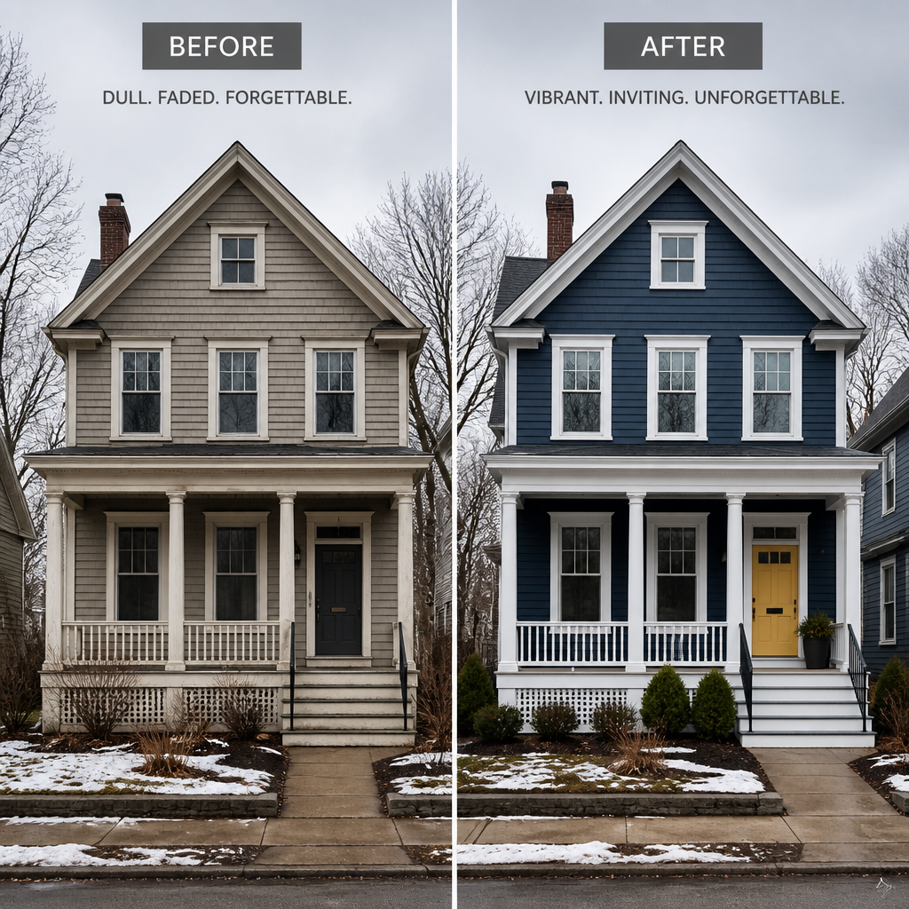
After more than three decades of exterior painting across Abbotsford, Langley, Surrey, and the broader Fraser Valley, certain palettes emerge as consistent performers. These are not trending colours that will feel dated in five years. They are colours with proven track records in this specific environment and in this specific housing market.
Warm Grey and Greige
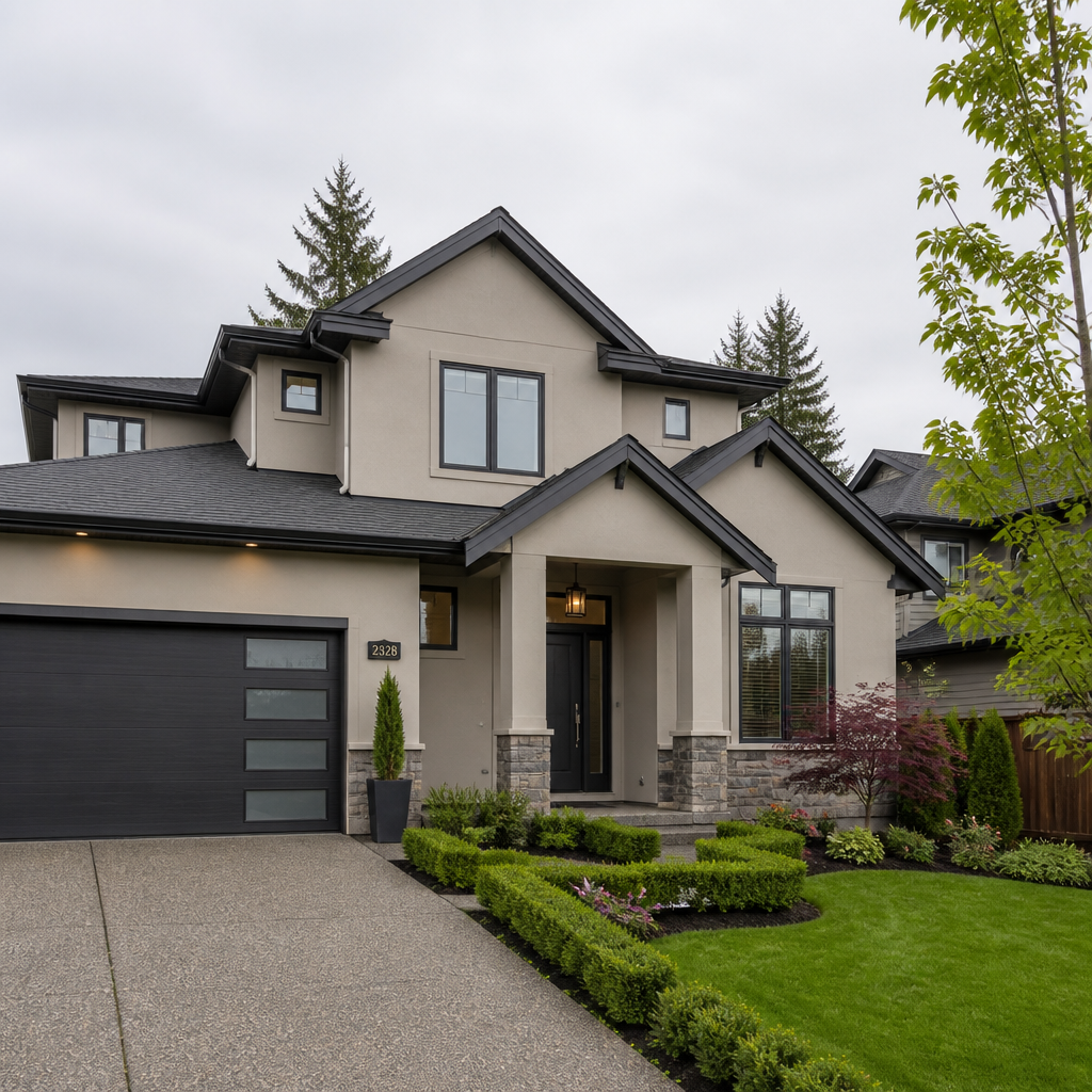
Warm greys and greige tones, which blend grey and beige into a single neutral, are the most widely requested exterior colours across the Lower Mainland and Fraser Valley. They perform well in rainy climates because mid-tones hide biological staining and everyday grime far better than very light or very dark shades. They are versatile enough to pair with black, white, or natural wood accents, and they do not date a home the way more fashionable colours do.
A reliable and widely used combination is a warm mid-tone grey or greige on the main body, a crisper white or off-white on the trim and fascia, and a deeper charcoal or black on the front door and shutters. This three-value system creates visual hierarchy and gives the home a finished, considered appearance from the street. It also photographs cleanly, which matters more than it once did now that the first impression of many homes happens in online listing photos.
Earthy Greens and Sage
Muted forest greens and sage tones are gaining serious traction in the Lower Mainland, and the reason is straightforward: they connect to the surrounding landscape rather than competing with it. A deep forest green on the main body, paired with natural wood or creamy white trim, anchors a home into its environment in a way that increases rather than interrupts the visual appeal of the street. These colours are also forgiving of small exterior imperfections because the depth of tone draws the eye to the overall silhouette rather than surface texture.
Earthy greens work especially well on lots with significant tree coverage, which describes a large proportion of homes in South Langley, Aldergrove, and the semi-rural stretches of Abbotsford. They complement cedar shakes and stone foundations, both common fixed materials on older Fraser Valley homes.
Warm White With Dark Accents
A warm white body paired with deep charcoal or black trim has emerged as a sharp, modern alternative to the cool white exteriors that were popular a decade ago. The key word here is warm. A white with yellow or cream undertones performs very differently in BC’s diffuse light than a stark, blue-toned white. Stark white reads clinical and cold under overcast skies and will show biological staining quickly in high-moisture areas. Warm white holds a welcoming appearance through the wet season and complements the warm tones of cedar, stone, and brick that appear as fixed materials on many Lower Mainland homes.
Muted Navy and Deep Charcoal
Bold body colours are gaining traction in the Lower Mainland. A muted navy or a deep charcoal, applied to the main body with natural wood or creamy white trim, creates a strong street presence. These dark palettes work particularly well on newer builds in Willoughby (Township of Langley), South Surrey’s more contemporary neighbourhoods, and the newer developments in east Abbotsford. In practice, darker colours require premium paint with UV-resistant pigments, particularly on south and west-facing elevations where solar degradation accelerates fading.
Pro tip: If you want a dark exterior but are concerned about heat absorption and fading, choose a colour with a slightly cooler undertone, such as a blue-black or green-black rather than a straight warm charcoal. It holds better on sun-exposed surfaces in the Lower Mainland.
Curb Appeal Painting Surrey: Neighbourhood by Neighbourhood
Surrey alone spans Fleetwood, South Surrey, Newton, Cloverdale, and Whalley, each with different housing stock, lot sizes, and neighbourhood expectations. Generic colour advice fails Surrey homeowners because the region is not generic. Driving through Cloverdale is a completely different visual experience than driving through Willoughby or Panorama Ridge, and the colour that works in one context can undermine curb appeal in another.
Cloverdale and Historic Areas
Cloverdale’s character streets reward heritage-appropriate palettes. Deep burgundy, olive green, and dusty gold body colours with creamy trim and dark accent details respect the Victorian and Craftsman architecture without turning the home into a museum piece. A common mistake in these areas is applying a modern flat greige that strips out the architectural detail rather than celebrating it. These older homes were designed with visual complexity, and the colour palette needs to reinforce the trim work, not erase it.
South Surrey, Willoughby, and Newer Developments
The modern farmhouse exterior still dominates new construction in Surrey and the Township of Langley. On these builds, warm whites with black trim are an obvious and effective choice. Many homeowners in this area are also choosing warm taupes and greiges over cool greys as a way to stand out while remaining resale-safe. The key in these streetscapes is differentiation within the palette, not departure from it. Neighbours on the same block may all gravitate to neutrals, but the warmth of undertone, the depth of the door colour, and the treatment of the garage door and fascia determine which homes have real curb appeal and which simply blend in.
Homes Near Green Space and the Fraser River
Homes further east in the Fraser Valley and those sitting on larger lots with significant green space around them benefit from colours that acknowledge the landscape. Warm taupes, earthy olive greens, and natural wood stains paired with stone grey trim read as grounded and well-considered. These choices increase resale appeal because they feel like a deliberate response to the setting, which signals to buyers that the home has been thoughtfully maintained.
Home Value Exterior Painting: What the Numbers Say
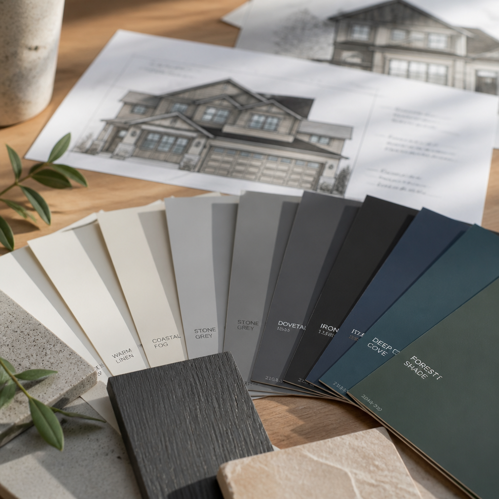
The financial case for a quality exterior repaint is well established. Research from Zillow has found that homes with a black front door can command a sale price premium of up to $6,000 compared to comparable homes with other door colours. Broader analyses of exterior painting ROI suggest returns in the range of 51 to 55 percent, meaning a homeowner who invests in a professional exterior repaint typically recoups more than half the cost immediately in added perceived value, with the remainder coming back through faster sale times and fewer low-ball offers from buyers concerned about deferred maintenance.
The logic is straightforward. A fresh, professionally applied exterior paint job covers dated colours, corrects visible wear, and signals to buyers that the property has been looked after before they ever step inside. In a competitive market across the Lower Mainland and Fraser Valley, where buyers have access to detailed listing photos before they visit in person, that first impression formed from a screen can determine whether your home gets added to a shortlist or passed over. Curb appeal painting in Surrey and across the Fraser Valley is not just about aesthetics. It is about market positioning.
Colour is not just a personal preference on exteriors. It is a technical decision shaped by light conditions, fixed materials, and architectural proportion. Getting the undertones right is the single highest-impact technical choice in any exterior painting project.
A professionally applied exterior paint job using premium materials on properly prepared surfaces should last between eight and twelve years in the Lower Mainland climate. South-facing and west-facing surfaces tend to experience more UV degradation and may show wear sooner. Homes with significant moisture exposure, such as those in high-precipitation areas of Chilliwack and Abbotsford near river corridors, benefit from inspection and touch-up at the five to seven year mark.
Colour Strategy Comparison: Safe, Trending, and Bold
| Strategy | Colour Examples for the Lower Mainland | Best For |
|---|---|---|
| Safe and Resale-Ready | Warm greige body, bright white trim, charcoal or black front door | Homeowners planning to sell within 1 to 3 years; homes in mixed or transitional neighbourhoods; buyers wanting broad appeal without risk |
| Trending and Current | Earthy forest green or sage body, natural wood accents, creamy white trim | Homes on treed lots in South Langley, Aldergrove, or semi-rural Abbotsford; owners who want to stand out without departing from the landscape |
| Bold and High-Impact | Deep navy or charcoal body, warm stone or wood trim, bronze hardware and door | Contemporary builds in Willoughby or South Surrey; owners with longer time horizons who want maximum street presence and are confident in colour selection |
Each of these strategies can increase curb appeal and home value when executed correctly. The distinction is in the risk profile and the neighbourhood fit. A safe palette is rarely wrong but rarely exceptional. A bold palette executed on the right home in the right context can be exceptional. The key variable is always the specific property: its architecture, its fixed materials, its neighbours, and how it sits on the street.
Common Exterior Colour Mistakes to Avoid
After decades of exterior painting across the Lower Mainland and Fraser Valley, the same errors appear repeatedly. They are worth addressing directly so homeowners can avoid them.
Choosing Colour From a Fan Deck Alone
The most common and most costly mistake is choosing a colour based entirely on how it looks on a small chip. Undertones shift dramatically when a colour is applied to a large vertical surface in actual daylight. A beige that looks perfectly neutral in a store reads pink on a west-facing wall in afternoon sun. Always test large-scale swatches outside on the actual surface before committing to a full repaint.
Ignoring the Neighbours
You do not need to match the surrounding homes, but a colour that clashes violently with every property on the street will stand out for the wrong reasons. Before finalizing a palette, drive the street and observe the collective tone. Work with it, not against it. This is not about conformity. It is about ensuring your colour choice reads as confident and considered rather than accidental or indifferent.
Rushing or Skipping Surface Preparation
The single most common source of exterior paint failure in the Lower Mainland is inadequate surface preparation. This means power washing, sanding, priming bare surfaces, and repairing caulking before a single drop of finish coat is applied. In BC’s high-moisture climate, any paint applied over biological growth, compromised caulking, or unprepared wood will fail years earlier than expected, regardless of how premium the finish coat product is.
Treating the Trim and Front Door as Afterthoughts
The trim, fascia, and front door are what the eye goes to first from the street. A strong trim and door colour can elevate a perfectly ordinary body colour into something that genuinely stands out. Treating them as incidental decisions, or worse, leaving them in whatever colour they were previously, is a missed opportunity that consistently reduces the impact of a fresh repaint.
Mixing Undertone Temperature Families
The most reliable exterior colour combinations use undertones from the same temperature family across body, trim, and accent colours. A warm-undertone body pairs with warm-undertone trim. A cool-undertone body pairs with cool-undertone trim. Mixing a warm grey body with a cool bright white trim introduces a subtle but jarring discord that experienced eyes notice immediately, even if the homeowner cannot initially identify why the finished result feels off.
Pro tip: When testing exterior paint samples, apply them directly to the actual wall surface and observe them at different times of day, not just midday. The shift from morning light to afternoon sun to overcast grey will reveal undertones that are completely invisible inside a paint store.
How to Choose the Right Palette for Your Specific Home
The process of choosing exterior paint colours for a Lower Mainland home should start with the fixed elements you cannot change: roof colour and material, stonework, brickwork, foundation colour, window frame colour, and any cladding that will not be painted. These fixed materials have their own undertones, and your paint palette needs to work with them rather than against them. A cool blue-grey paint on a home with a warm brown cedar shake roof will always look wrong, regardless of how attractive either element is on its own.
Start With Your Roof and Fixed Cladding
The roof can account for a significant portion of the home’s total exterior visual mass. Identify whether it reads as warm or cool, brown or grey, and let that guide the temperature of your body and trim colours. This is the step that most homeowners skip when browsing paint chips, and it is the step that produces the most regrettable results when ignored.
Use a Three-Value Palette
The most reliable exterior colour system for Lower Mainland homes uses three values: a mid-tone body colour, a lighter trim and fascia colour, and a darker accent colour on the front door, shutters, and architectural details. This structure creates visual hierarchy, gives the home depth from a distance, and ensures the finished result reads as complete and intentional rather than flat and monotone.
Work With a Local Professional
Online colour tools and virtual visualizers are useful starting points, but they do not replicate the experience of seeing a colour on your specific home in your specific neighbourhood under actual BC light conditions. Working with an experienced local painting contractor who knows how colours perform on Lower Mainland and Fraser Valley homes in real conditions is worth significantly more than any digital tool. At Dreamscape Painting, our experienced estimators have spent decades helping homeowners across Abbotsford, Langley, Surrey, and the broader Fraser Valley make confident exterior colour choices. An in-person consultation removes the guesswork entirely and ensures the palette you choose looks as good in January rain as it does in August sun.
If you are preparing your home for sale, considering a significant exterior refresh, or simply want the repaint to last and look right, the contact page is the place to start. Our team has been doing this work across the Lower Mainland since 1990, and the colour advice we offer is grounded in real project experience, not generic guidance.
Frequently Asked Questions
What exterior paint colours are best for Lower Mainland homes with overcast light?
Warm-toned neutrals perform best under the diffuse grey light common across the Lower Mainland for much of the year. Warm greys, greige tones, warm whites, and earthy greens all hold their richness under cloud cover because their underlying pigments push through diffuse light effectively. Cool-toned colours, particularly cool whites and blue-based greys, tend to appear flat and washed out under BC’s overcast skies, which is why they are less effective here than they might be in sunnier climates.
Does exterior paint colour actually affect home resale value?
Yes, and the effect is measurable. Research by Zillow has found that specific front door colours, particularly black, can add up to $6,000 to a home’s sale price. Broader studies on exterior painting ROI place the return in the range of 51 to 55 percent on the cost of the project. Beyond the numbers, the practical impact is that a fresh, well-chosen exterior paint job signals to buyers that a home has been maintained, which reduces the mental price discount buyers apply when they see deferred upkeep.
How long should a professional exterior paint job last in BC’s climate?
A professionally applied exterior paint job using premium materials on properly prepared surfaces should last between eight and twelve years in the Lower Mainland climate. South-facing and west-facing elevations experience more UV degradation and may require attention before the north and east faces do. Homes in high-moisture areas, particularly those near river corridors or areas of heavy tree cover that limit airflow, benefit from inspection at the five to seven year mark.
Should I match my neighbours’ exterior colours in Surrey or Langley?
You do not need to match, but you do need to work within the collective palette of the street. A colour that clashes violently with every adjacent property will stand out for the wrong reasons and can actively reduce curb appeal rather than increase it. The goal is to be distinctive within the context of your neighbourhood, not to depart from it entirely. Drive the street at different times of day, observe the dominant tones, and choose a palette that reads as confident and considered rather than out of place.
Is it worth paying for a professional exterior painter instead of doing it yourself?
For most Lower Mainland homeowners, yes. The value of a professional exterior repaint comes as much from surface preparation as from the paint itself. Power washing, sanding, spot priming, caulking, and correct application technique in the right weather window are the steps that determine whether the result lasts eight years or two. DIY exterior painting that skips or rushes preparation will fail early in BC’s demanding climate, and the cost of repainting sooner than expected eliminates any savings made by doing the first job yourself. If you are investing in the right paint colours and the right palette, investing in professional application protects that decision.
What is a greige exterior colour and why is it popular in the Fraser Valley?
Greige is a blend of grey and beige that produces a warm neutral with more depth than standard beige and more warmth than standard grey. It is popular across the Lower Mainland and Fraser Valley for several practical reasons: it hides biological staining and everyday grime from high rainfall better than lighter colours, it holds its appearance under both overcast and sunny conditions, it pairs well with a wide range of trim and accent colours, and it appeals broadly to buyers at resale. It is also versatile across different architectural styles, working on craftsman bungalows, stucco ranchers, and newer farmhouse builds alike.
If you have recently repainted your home’s exterior or are in the middle of a colour decision, we would love to hear what palette you chose and how the Lower Mainland’s light conditions shaped your thinking. Share your experience in the comments below.
We would love your feedback and any insights you would share with others. What perspective would you add?
References
- How much exterior paint increases home value, with ROI data and colour analysis
- Best exterior paint colours that increase home value and improve listing photos
- Exterior house paint colour guidance by climate type, including coastal and rainy regions
- Exterior paint colour advice for Canadian homes and resale appeal in varied climates
- Paint colours that boost home value, with ROI research and buyer preference data

