

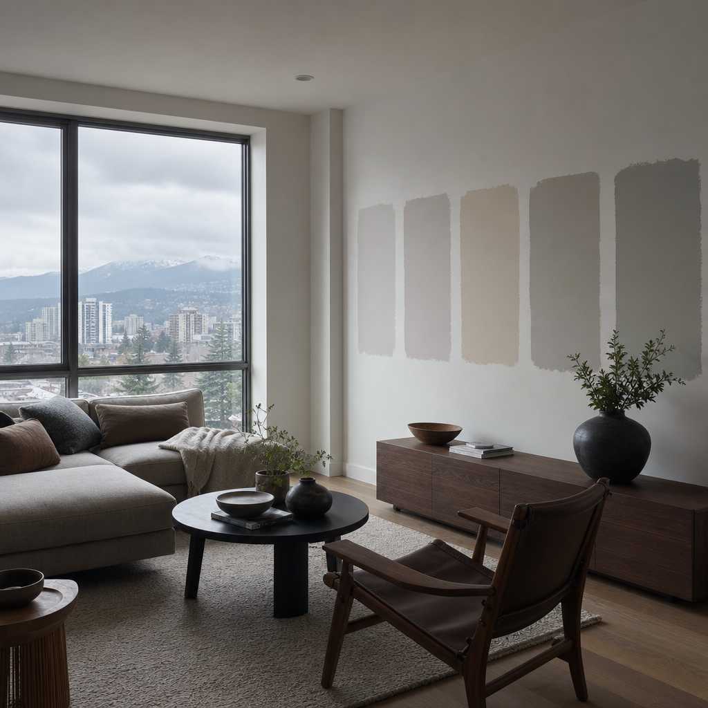
Picking the wrong paint colour is one of the most expensive mistakes a homeowner can make. You buy the sample, paint the wall, and then stand back to realize the colour looks nothing like it did on the chip. In the Lower Mainland and Fraser Valley, this problem is made worse by the region’s notoriously overcast light, which shifts undertones in ways that catch even experienced decorators off guard. This interior paint colour guide Vancouver homeowners actually need cuts through the confusion with practical, tested advice drawn from over three decades of painting homes across Abbotsford, Langley, Surrey, and beyond.
Table of Contents
- Quick Takeaways
- Why Vancouver Light Changes Everything
- Understanding Undertones Before You Buy a Single Can
- Room-by-Room Colour Strategy for Lower Mainland Homes
- Paint Finish Selection: The Detail Most Homeowners Skip
- Comparing Colour Selection Approaches
- Common Colour Mistakes in Lower Mainland Homes
- Working With a Professional Painter on Colour Selection
- Frequently Asked Questions
- References
Quick Takeaways
| Key Insight | Explanation |
|---|---|
| Test colours in your actual room lighting | Vancouver’s grey, diffused daylight changes how undertones read on walls. A warm white tested in a showroom will look entirely different under north-facing natural light at home. |
| Undertones matter more than the main colour | A grey with pink undertones can clash with wood flooring that has orange tones. Identifying undertones before purchasing prevents costly repaints. |
| Use large sample swatches, not chip cards | A 12×12 inch painted sample on the wall gives a far more accurate reading than a 2-inch chip. Most Lower Mainland homeowners misjudge colour from small chips. |
| Finish type affects colour perception | Eggshell and matte finishes absorb light and make colours appear slightly darker and more saturated than semi-gloss versions of the same colour. |
| Open-concept homes need a connected colour palette | Many Fraser Valley homes have open floor plans. Choosing colours that share the same undertone family prevents a disjointed, choppy appearance across connected spaces. |
| Ceiling colour impacts perceived ceiling height | Painting the ceiling one to two shades lighter than the walls makes rooms feel taller. This is especially useful in older Abbotsford and Langley homes with standard 8-foot ceilings. |
| Exterior colours affect interior mood through windows | In the Lower Mainland, green landscaping and grey skies filter in through windows and cast a cool tint indoors. This should influence whether you lean warm or neutral on interior walls. |
Why Vancouver Light Changes Everything

The single biggest factor driving poor colour decisions in Vancouver and the Fraser Valley is light, specifically the quality of natural light in this region. The Lower Mainland sits under cloud cover for a significant portion of the year. That diffused, indirect light strips warmth from paint colours and amplifies cool undertones in ways that direct sunlight simply does not.
In practice, a colour labelled as a warm greige in a Toronto showroom will read as a flat, cold taupe in a north-facing Surrey living room in November. This is not a product defect. It is physics. The light temperature changes the way your eyes process the pigment on the wall.
South and west-facing rooms in the Lower Mainland receive more direct light during afternoon hours, which adds warmth and allows you to experiment with cooler tones without them feeling sterile. North and east-facing rooms stay cool all day, and that calls for warmer undertones in your colour selection to compensate. This is one of the most consistent pieces of interior painting tips that professional painters in the region give homeowners, and it is one of the most frequently ignored.
Pro tip: Before committing to any colour, paint a large swatch directly on the wall and observe it at three different times of day: morning, midday, and evening with your artificial lights on. Each observation will give you a different reading, and all three matter.
Understanding Undertones Before You Buy a Single Can
Most homeowners pick a colour because they like its general hue, say a soft blue-grey or a warm beige. What they overlook is the undertone hiding inside that colour, and that undertone is what causes regret after the walls are painted.
How to Identify Undertones on a Paint Chip
Hold the paint chip next to a pure white surface. The difference you see between the chip and the white tells you the undertone’s direction. Blues will look greener or purpler. Whites will reveal whether they are pink, yellow, or green. Greys will show whether they lean blue, purple, or brown.
A common mistake is selecting a neutral colour without checking whether it clashes with the fixed elements in the room, specifically the flooring, cabinetry, and trim. In many Fraser Valley homes built in the 1990s and 2000s, the existing trim is a bright white with a yellow undertone. Pairing that with a cool grey wall that has blue undertones creates a visible tension that no amount of staging can fix.
Warm vs. Cool Undertones in Lower Mainland Homes
Warm undertones, yellows, oranges, and reds, add coziness and counterbalance the cool, grey outdoor light. They work well in living rooms, dining rooms, and bedrooms where you want the space to feel inviting despite the weather outside.
Cool undertones, blues, greens, and purples, can feel refreshing in bathrooms and home offices, but they demand more natural light to avoid feeling cold. In a darker Langley or Abbotsford home with limited window exposure, cool undertones often disappoint on the wall even when they looked stunning on the chip.
“Colour is 70 percent light and 30 percent pigment. You are not just choosing a colour. You are choosing how light will behave in your room.” – Robin Standefer, interior designer, as cited in Architectural Digest
Room-by-Room Colour Strategy for Lower Mainland Homes
There is no universal colour that works in every room. Each space in your home has a different purpose, a different amount of natural light, and different fixed elements that constrain your choices. Treating paint colour selection Lower Mainland as a room-by-room decision rather than a whole-house decision leads to far better outcomes.
Living Rooms and Open-Concept Main Floors
Open-concept layouts, common in Surrey and Langley homes built after 2000, require you to think about colours as a system rather than individual choices. Choose one anchor colour for the largest visible wall surface, then select one or two supporting colours that share the same undertone family. This creates visual flow without making the space feel monotonous.
In practice, a warm greige on the main living area walls paired with a slightly deeper version of the same tone in the dining nook creates depth and definition without clashing. Avoid switching undertone families between connected spaces. That is the most reliable way to make an open floor plan feel disjointed.
Bedrooms
Bedrooms are forgiving because they are used primarily in low light conditions and with artificial lighting. This gives you more creative freedom. Deeper, more saturated colours work well in bedrooms even in north-facing rooms, because the space is not expected to feel bright during its primary use hours.
Dusty blues, sage greens, and warm terracotta tones are currently performing well in Fraser Valley bedrooms, both aesthetically and in terms of perceived home value. According to Zillow’s analysis of home sale data, homes with blue-toned bedrooms sold for a premium compared to homes with white or beige bedrooms.
Kitchens and Bathrooms
These rooms have more tile, cabinetry, and fixed surfaces than any other room in the home. Your paint colour must work with those elements, not compete with them. In kitchens with white shaker cabinets, almost any soft neutral will work. In kitchens with natural wood cabinetry, avoid cool greys because the contrast with the warm wood tones creates visual noise.
Bathrooms benefit from lighter values because the space is typically smaller and benefits from reflected light. A soft warm white or a very light sage creates a clean, spa-like feeling that darker colours undermine.

Pro tip: In kitchens where Dreamscape Painting has completed cabinet refinishing alongside wall repainting, the most successful outcomes come from selecting the wall colour after the cabinet colour is finalized. The cabinet is the dominant element and should drive the palette decision.
Paint Finish Selection: The Detail Most Homeowners Skip
Colour and finish are inseparable. The same pigment formula applied in a flat matte finish versus a semi-gloss finish will produce noticeably different results on the wall. Understanding this relationship is a non-negotiable part of any honest interior paint colour guide Vancouver homeowners can act on.
Finish Options and Where They Belong
Flat and matte finishes absorb light and conceal surface imperfections. They are ideal for ceilings and low-traffic bedroom walls, but they are not washable and will show scuffs in hallways or kitchens. Eggshell is the workhorse finish for main living areas: it has a very slight sheen, is cleanable, and does not amplify imperfections the way satin and semi-gloss do.
Satin and semi-gloss are best reserved for trim, doors, and cabinetry. These finishes reflect light more aggressively and will highlight every roller mark or surface bump on a wall. Using semi-gloss on walls is a common mistake in Fraser Valley homes that leads to a painted surface that looks rushed rather than refined.
How Finish Affects Colour Appearance
A matte finish makes colours appear slightly darker and more saturated because the surface does not bounce light back to the eye. An eggshell of the same colour will read slightly lighter and less intense. When testing colour samples, always apply them in the finish you intend to use for the final coat. Testing in flat and painting in eggshell introduces a variable that will shift your result.
Comparing Colour Selection Approaches
There are three main ways homeowners in the Lower Mainland approach colour selection. Each has real tradeoffs worth understanding before you commit time or money.
| Approach | Best For | Key Limitation |
|---|---|---|
| Digital colour visualization tools (Benjamin Moore, Sherwin-Williams apps) | Getting a rough initial direction and eliminating obvious mismatches before purchasing samples | Screen calibration varies significantly. The colour on your phone or monitor will not match the actual paint. Use it for shortlisting only, never for final decisions. |
| Paint chip sampling from hardware store | Narrowing down a shortlist of 3-5 options inexpensively | Chip cards are too small to give an accurate read. The brain cannot extrapolate how a 2-inch chip will behave across an entire wall. A chip that looks perfect in the store will frequently disappoint on the wall. |
| Large-format wall sample testing (12×12 inches minimum, painted directly on the wall) | Making a final confident decision before purchasing full quantities of paint | Requires buying small sample pots and investing time in application. This is the most reliable method and the only one professional painters consistently recommend. The cost of a few sample pots is always less than the cost of a full repaint. |
Common Colour Mistakes in Lower Mainland Homes
After 35 years of painting homes across Abbotsford, Langley, Surrey, and the greater Lower Mainland, there are patterns to the mistakes homeowners make. These are not random errors. They are predictable, and knowing them saves money.
The first and most common mistake is choosing colour based on a paint brand’s marketing imagery. Those photos are shot under ideal lighting conditions in staged spaces that bear no resemblance to your actual home. The colour that looks effortlessly sophisticated in a brand’s lifestyle photo may look muddy or flat under your specific lighting conditions.
The second mistake is ignoring the 60-30-10 rule. This guideline suggests that in any room, 60 percent of the visual field should be the dominant colour (typically the walls), 30 percent a secondary colour (furniture, rugs), and 10 percent an accent colour (throw pillows, art, fixtures). Homeowners who violate this ratio by using too many competing colours end up with rooms that feel busy and exhausting rather than designed.
The third mistake is painting the trim the same colour as the walls. While this is a deliberate design choice in some modern interiors, in most Lower Mainland homes with traditional moulding profiles, it erases architectural detail and makes the room feel unfinished. White or off-white trim creates definition and makes the wall colour read more cleanly.
The fourth mistake is choosing a colour that works in one season but fails in another. In the Lower Mainland, the shift from summer light to winter grey is dramatic. A colour that feels fresh and airy in July can feel oppressively dark by December. Testing your colour choice during the greyest available day, not just on a sunny afternoon, is the most reliable safeguard against this problem.
Working With a Professional Painter on Colour Selection
A professional painter does not just apply paint. An experienced team brings practical colour knowledge accumulated from hundreds of completed projects in homes that look like yours, face the same light conditions, and have the same fixed elements you are working around.
At Dreamscape Painting, the estimators who walk through your home before a project begins bring this accumulated knowledge to the conversation. They can tell you, based on your specific room orientation and natural light exposure, whether the colour you are considering is likely to disappoint. That kind of site-specific feedback is not available from a paint store associate or a digital app.
Professional painters also understand how surface preparation affects colour outcome. A wall with previous colour bleed-through, patchy repairs, or uneven sheen levels will not show a new colour cleanly regardless of how good the paint is. Proper priming, especially when making a dramatic colour shift, is essential to achieving the result you see in the sample.
When working with a professional team on interior painting, ask specifically about their process for colour-shift projects where you are moving from a dark colour to a light one or vice versa. The answer tells you a great deal about their attention to detail. A team that skips primer on a colour-shift job is cutting a corner that will show up in the finished work.
For homeowners in Abbotsford, Langley, Surrey, and surrounding areas, Dreamscape Painting’s interior painting services include professional colour consultation as part of the project process. The company’s 35-year track record in the Lower Mainland means the advice is grounded in regional experience, not generic product recommendations.
Frequently Asked Questions
How many paint colours should I use in my home?
For most Lower Mainland homes, a palette of three to five coordinated colours across the entire interior is the right range. One dominant neutral for main living areas, one or two accent colours for bedrooms or feature walls, and a consistent trim colour. Going beyond five distinct colours in a single home typically creates visual fragmentation that makes the space feel smaller and less cohesive. If you want a feature wall to stand out through texture as well as colour, our guide to decorative painting techniques covers limewash, Venetian plaster and more.
Should I match my interior paint colours to my exterior?
You do not need to match them, but you should not ignore the relationship entirely. In the Lower Mainland, where the green of the landscape and the grey of the sky are visible through windows year-round, your exterior surroundings become part of the interior visual environment. Choosing interior colours that are tonally compatible with the exterior creates a natural visual flow between inside and outside.
What are the most popular interior paint colours for Fraser Valley homes right now?
Based on current project work across Abbotsford, Langley, and Surrey, the most requested colours in 2024 and into 2025 are warm whites with yellow or cream undertones, muted sage greens, dusty warm blues for bedrooms, and deep charcoal or forest green for accent walls and feature spaces. Stark, cool whites have been declining in favour of warmer, more textured neutrals that feel less clinical and more livable during the grey Lower Mainland winters.
How do I choose a paint colour for an open-concept floor plan?
Start by identifying the undertone that appears in your largest fixed element, typically the flooring. Build your palette around colours that share that undertone or are at least neutral enough not to clash with it. In open-concept spaces, the wall colour travels with the eye across the entire visible space, so a colour that works in isolation in the living area may feel disconnected when viewed from the kitchen. Test your shortlisted colours from multiple vantage points within the open space before deciding.
Is it worth hiring a professional painter even if I plan to choose the colour myself?
Yes, without qualification. The colour you choose matters, but the quality of the application determines whether that colour looks the way it should. Poor surface preparation, insufficient primer, uneven roller technique, and missed cut-in lines will make even the most carefully chosen colour look amateur. A professional team like Dreamscape Painting delivers the surface quality that allows the colour to perform as intended.
How long does interior paint last before it needs to be refreshed?
In well-maintained Lower Mainland homes, a professionally applied interior paint job using quality product should last 7 to 10 years in low-traffic areas and 5 to 7 years in high-traffic areas like hallways, kitchens, and bathrooms. Homes with young children or pets typically see more wear on wall surfaces and may need touch-up or full repaints on a shorter cycle. Using a washable eggshell or satin finish in high-traffic areas extends the usable life of the paint significantly.
If you have recently navigated an interior colour selection in a Lower Mainland home, share what worked and what you would do differently. Real-world experience from Fraser Valley homeowners helps others avoid the same pitfalls.
References
- Forbes: Home improvement trends and expert design advice for homeowners
- Statista: Market data and consumer research on home renovation and paint industry trends
- Better Homes and Gardens: Practical interior colour selection guides and room-by-room paint advice
- The Spruce: Expert guidance on understanding paint undertones and finish selection for interior spaces
- Houzz: Real homeowner project photos and professional painter recommendations for Canadian homes

