
Choosing the wrong interior paint colour is one of the most expensive mistakes a homeowner can make, not because paint is cheap to buy, but because it is expensive to redo. If you have ever painted a room only to live with a colour you quietly hate for three years, you already know this. For homeowners across Abbotsford, Langley, Surrey, and the broader Fraser Valley, the challenge is compounded by something most generic colour guides ignore: the specific quality of natural light here, the architectural character of Fraser Valley homes, and how those factors interact with the warm, earthy palette that is dominating interior paint colours 2026. Getting this right requires more than picking something off a trending list. This guide will walk you through exactly how to do it for your home, neighbourhood, and lifestyle.
Table of Contents
- Why Fraser Valley Light Changes Everything
- 2026 Interior Paint Colour Trends: What Actually Works Here
- Room-by-Room Colour Strategy for Fraser Valley Homes
- How to Test Paint Colours Before You Commit
- Comparing Colour Selection Approaches
- When to Call a Professional Interior Painter
- Frequently Asked Questions
- References
Why Fraser Valley Light Changes Everything
The Fraser Valley sits in a geography that produces a specific quality of daylight. Overcast skies are common for much of the year, particularly from October through March. That diffused, grey-tinged light flattens colours and amplifies cool undertones in paint. A colour that looks like a warm greige on a paint chip in a brightly lit showroom can read as a cold, slightly purple grey on your Langley living room wall in November.
This is the single most important thing to understand about interior painting Fraser Valley projects: the light here punishes colours with cool or blue undertones far more than the light in sunnier climates. Sherwin-Williams Universal Khaki, the brand’s 2026 Colour of the Year, works well in this region precisely because its warm yellow undertone holds up under diffused natural light without looking muddy or flat.
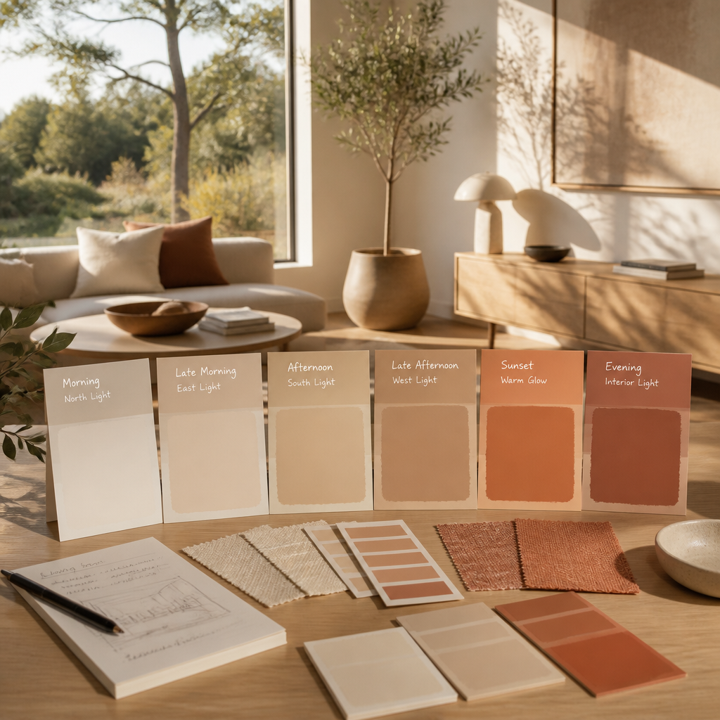
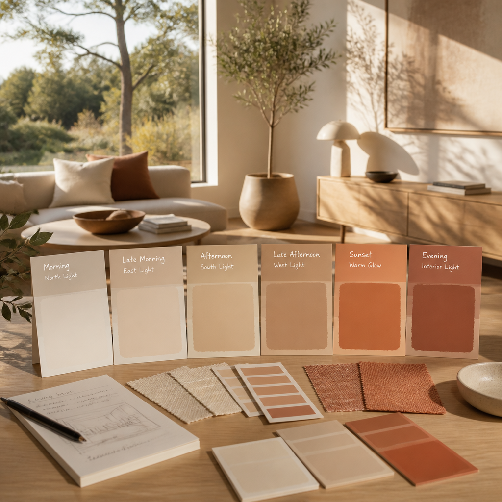
South-facing rooms in Fraser Valley homes tend to get the most consistent warm light during the day, which gives you more flexibility with slightly cooler or mid-tone colours. North-facing rooms, on the other hand, need colours with clearly warm undertones, because they will never receive direct sunlight to balance out a cool-leaning hue. A common mistake is choosing the same colour throughout an open-plan home without accounting for how dramatically the light shifts between the south-facing kitchen and the north-facing family room.
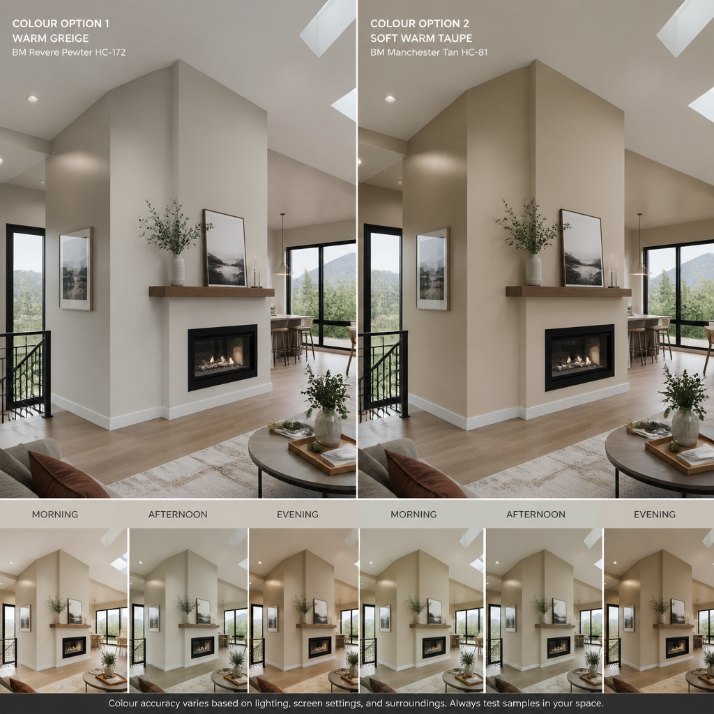
Pro tip: Before committing to any colour, hold your paint chip against the wall at different times of day: morning, midday, and in the evening under artificial light. What you see at noon is rarely what you will live with at 7 pm on a cloudy Tuesday in February.
2026 Interior Paint Colour Trends: What Actually Works Here
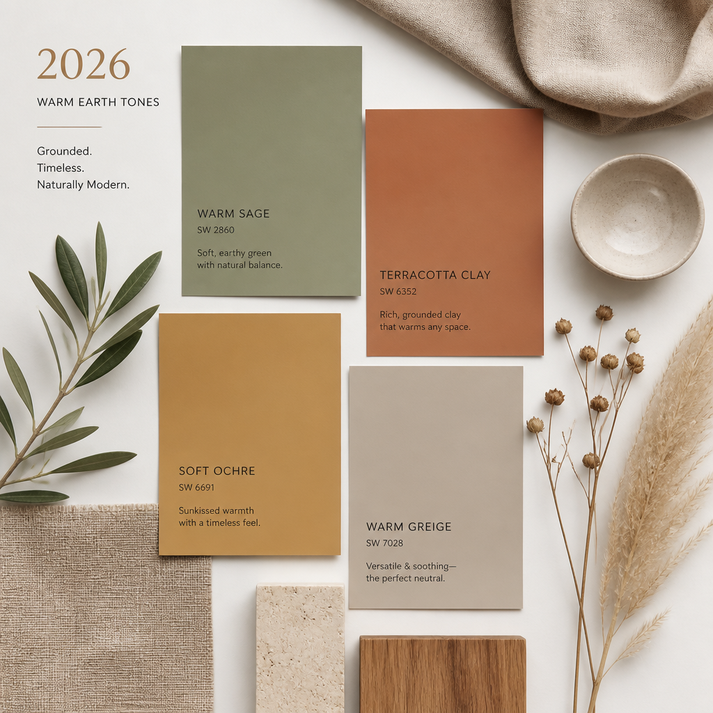
The 2026 palette across every major paint brand has shifted decisively away from the cool greys that dominated the previous decade. Sherwin-Williams chose Universal Khaki SW 6150, an earthy mid-tone tan with a warm yellow undertone. Benjamin Moore chose Silhouette AF-655, a rich espresso brown with charcoal undertones. Behr went with Hidden Gem N430-6A, a smoky jade blue-green. Valspar selected Warm Eucalyptus 8004-28F, a serene silver-tinted green. Pantone named Cloud Dancer, a soft, airy off-white.
The common thread is grounding: these are colours drawn from the natural world, and they work particularly well in the Fraser Valley because they echo the landscape outside the window. The greens, tans, and warm whites feel at home in a region surrounded by farmland, mountains, and forest. That alignment between interior and exterior environment is not a coincidence. It is one of the reasons these colours feel so liveable in this specific geography.
Which 2026 Colours Work Best in Fraser Valley Homes
Universal Khaki and its warm neutral cousins are strong choices for high-traffic areas like living rooms and hallways. They read as sophisticated without demanding a specific furniture style, which matters in the mix of ranchers, split-levels, and newer builds that characterize residential neighbourhoods across Surrey, Abbotsford, and Langley.
The nature-inspired greens, such as Warm Eucalyptus or Hidden Gem, work well in bedrooms and bathrooms where a spa-like calm is the goal. However, be cautious with blue-greens in north-facing rooms. The smoky undertone in Hidden Gem can read as cold without adequate warm lighting. Pair it with warm-toned light fixtures and natural wood accents to prevent it from feeling clinical.
Benjamin Moore Silhouette is best reserved for accent walls or rooms where you want a deliberate, dramatic statement, such as a dining room or a home office. Using it on all four walls of a Fraser Valley home that already has limited natural light in winter is a choice that looks striking in design photography and oppressive in daily life.
Pro tip: If you are drawn to the deep, moody tones trending in 2026, use them on a single accent wall and choose a warm off-white for the remaining three walls. You get the visual impact without the light-absorbing drawback.
Room-by-Room Colour Strategy for Fraser Valley Homes
Generic colour guides tell you what colours are trending. What they rarely tell you is how to sequence a colour palette through an actual home so it flows logically from room to room. In residential painting Langley and across the Fraser Valley, the homes we see most often are open-plan main floors with connected kitchens, dining areas, and living rooms. That layout demands a cohesive approach that a room-by-room list cannot give you.
Main Living Areas and Open-Plan Spaces
For open-plan spaces, choose a single warm neutral as your anchor colour and use it consistently across the connected areas. Universal Khaki, a warm greige, or a soft off-white like Pantone’s Cloud Dancer all work here. Introduce variation through trim colour, cabinetry, and furnishings rather than by changing wall colours every few metres. Frequent colour changes in open-plan layouts feel choppy, not creative.
Kitchens and Dining Rooms
Kitchens benefit from lighter, cleaner colours that reflect light and make the space feel larger. A warm white or soft cream on the walls lets cabinetry be the visual statement, which is especially relevant if you are considering cabinet refinishing alongside your interior painting project. Dining rooms can handle slightly richer tones. A warm terracotta, a deep warm green, or even a muted ochre can make a dining room feel grounded and intimate without going so dark that it kills the afternoon light.
Bedrooms and Bathrooms
Bedrooms should prioritize calm over trend. In 2026, that means soft greens, warm taupes, and quiet off-whites. Avoid anything with a strong cool undertone in a bedroom that faces north or east. Bathrooms are one of the few spaces where a bolder choice pays off, because the room is small enough that even a dark or saturated colour does not overwhelm you. A deep navy, a warm charcoal, or a botanical green can make a bathroom feel considered and deliberate rather than builder-grade.
How to Test Paint Colours Before You Commit
The single biggest source of colour regret is skipping the testing phase. Buying a sample pot and painting a large swatch directly onto your wall is non-negotiable. A 30 cm by 30 cm swatch is not large enough. Paint at least a 60 cm by 60 cm area, ideally larger, and observe it over several days at different times of day and in different lighting conditions.
Paint the swatch on multiple walls in the same room if the room has both well-lit and shadowed walls. The colour will look different on each surface, and you need to see both before committing to a full room. This is not perfectionism. It is the standard practice that professional interior painters follow before any large-scale project.
Using Digital Visualizers as a Starting Point
Several paint brands offer online room visualizers that let you upload a photo of your space and preview colours digitally. These tools are useful for narrowing down a shortlist, but they are not a substitute for physical samples. Screen colour rendering is not accurate enough to make a final decision. Use visualizers to eliminate obvious mismatches, then test your final two or three contenders as physical swatches.
What a Colour Consultation Actually Covers
A professional colour consultation with an experienced painting company goes beyond handing you a fan deck. It includes assessing your home’s natural light at different times of day, understanding how your existing flooring, trim, and cabinetry affect colour perception, and helping you build a whole-home palette that flows rather than clashes. For homeowners who feel overwhelmed by the choice, this step saves significant time and avoids costly repaints. At Dreamscape Painting, our estimators and painters bring this kind of context to every project before a single drop of paint goes on the wall.
A colour consultation is not an upsell. It is the difference between a home refresh that looks intentional and one that looks accidental. The wall colour alone does not transform a space. The wall colour in relationship to the light, the trim, and the room’s purpose does.
Comparing Colour Selection Approaches
Not every homeowner approaches colour selection the same way. Below is a straightforward comparison of the three most common approaches used in Fraser Valley interior painting projects, along with the realistic trade-offs of each.
| Approach | Best For | Key Trade-Off |
|---|---|---|
| DIY colour selection using paint brand tools and trend guides | Confident homeowners who have painted before and know how light works in their home | High risk of undertone mismatches, especially in Fraser Valley’s overcast light conditions. Repaints are costly. |
| In-store colour consultation at a paint retailer | Homeowners who want some guidance without committing to a full professional service | Retailer consultants have not seen your home. Their advice is general, not site-specific. Light conditions in-store bear no resemblance to your living room. |
| Professional colour consultation through your painting contractor | Homeowners doing a full interior repaint, multi-room projects, or anyone who has made expensive colour mistakes before | Adds a step to the process, but virtually eliminates the risk of a costly repaint. Produces a cohesive whole-home palette tailored to your specific home and light. |
When to Call a Professional Interior Painter
There is a version of this conversation that is mostly about colour theory and trends, and then there is the practical reality: the quality of the finished paint job matters as much as the colour you choose. A mediocre paint job in a beautiful colour still looks mediocre. A skilled application of an average colour still looks sharp and clean.
For homeowners in Abbotsford, Langley, Surrey, and across the Fraser Valley, the decision to hire a professional interior painter comes down to three factors: the scope of the project, the condition of the walls, and the finish quality you expect to live with. If your walls have cracks, old texture, or uneven surfaces, no amount of good colour selection will hide the problems underneath. Surface preparation, including drywall repair, sanding, and proper priming, is what separates a professional result from an amateur one.
What Dreamscape Painting Does Differently
Dreamscape Painting has been serving Fraser Valley and Lower Mainland homeowners since 1990. That is more than three decades of working in the specific light conditions, home styles, and climate of this region. Our painters understand how the wet winters affect wall surfaces, why proper priming matters more in humid climates, and how to achieve clean, sharp lines in homes with older trim profiles.
We also prioritize cleanliness and protection of your home during every project. Furniture is moved and covered. Floors are protected. The job site is left clean at the end of every day. For homeowners comparing options across the Lower Mainland, including interior painting Vancouver and residential painting Langley services, the difference between a company with 35 years of family-owned experience and a franchise operation is visible in the finished work.
Whether you are refreshing a single room or repainting your entire home, our team handles interior painting, exterior painting, and cabinet refinishing with the same standard of craftsmanship. You can learn more about our services and request an estimate at www.dreamscapepainting.com.
Pro tip: When getting estimates for an interior painting project, ask each contractor specifically how they handle surface preparation. The answer tells you more about the quality of their work than any before-and-after photo.
Frequently Asked Questions
What interior paint colours work best in Fraser Valley homes with limited natural light?
Warm neutrals with yellow or golden undertones perform best in low-light conditions. Colours like Sherwin-Williams Universal Khaki, warm taupes, and soft creams hold their warmth under diffused light. Avoid anything with cool grey, blue, or purple undertones, as these will read as cold and flat in rooms that do not receive direct sunlight. If you want to go lighter, a warm off-white such as Pantone’s Cloud Dancer is a safer choice than a stark cool white.
How many paint colours should I use throughout my home?
For a cohesive result, most homes work best with one anchor neutral used across main living areas, one or two accent or complementary colours used in secondary rooms like bedrooms or a dining room, and a consistent trim colour used throughout. Three to four colours total is the practical upper limit for most homes. More than that rarely looks intentional. It usually looks like the result of making decisions one room at a time without a whole-home plan.
Is it worth hiring a professional painter for an interior home refresh, or is DIY good enough?
It depends on your wall condition and the finish you expect. If your walls are in good shape, you are comfortable with cutting in, and you are painting a single room with a forgiving sheen like eggshell, a capable DIYer can get a decent result. For whole-home repaints, rooms with high ceilings, walls with surface damage, or any space where you expect a crisp, professional finish, hiring an experienced painting contractor is a better investment. The surface preparation and application quality that a skilled painter delivers will last significantly longer and look better than a rushed DIY job.
What paint sheen should I use for different rooms in my home?
Flat or matte finishes work well in low-traffic areas like adult bedrooms, where hiding imperfections matters more than washability. Eggshell is the most versatile choice for living rooms and dining rooms. Satin is better for kitchens, bathrooms, and hallways where the walls need to be wiped down regularly. Semi-gloss is best reserved for trim, doors, and cabinetry. Avoid flat paint in high-traffic areas, it stains easily and cannot be cleaned without removing the finish.
How long does a professional interior painting project typically take for a Fraser Valley home?
A standard three-bedroom home with one main living area typically takes two to four days for a professional crew, depending on the scope of surface preparation required, the number of colours being used, and whether any trim or cabinetry work is included. Homes that need significant drywall repair or multiple coats due to a dramatic colour change will take longer. A reputable painting company will give you a specific timeline as part of your estimate, not a vague range that leaves you guessing.
What is the best way to find a reliable interior painter in Langley or Abbotsford?
Ask for references from completed local projects, not just online reviews. A painter who has worked consistently in your area for years will have verifiable local references. Confirm that they carry proper liability insurance and WorkSafeBC coverage. Get a written estimate that itemizes surface preparation separately from painting, so you understand exactly what is included. Companies with long local histories, like Dreamscape Painting’s 35-plus years in the Fraser Valley and Lower Mainland, have a track record you can actually check.
What colour choices have worked best in your Fraser Valley home, and what would you do differently if you were starting over? Share your experience below.

