

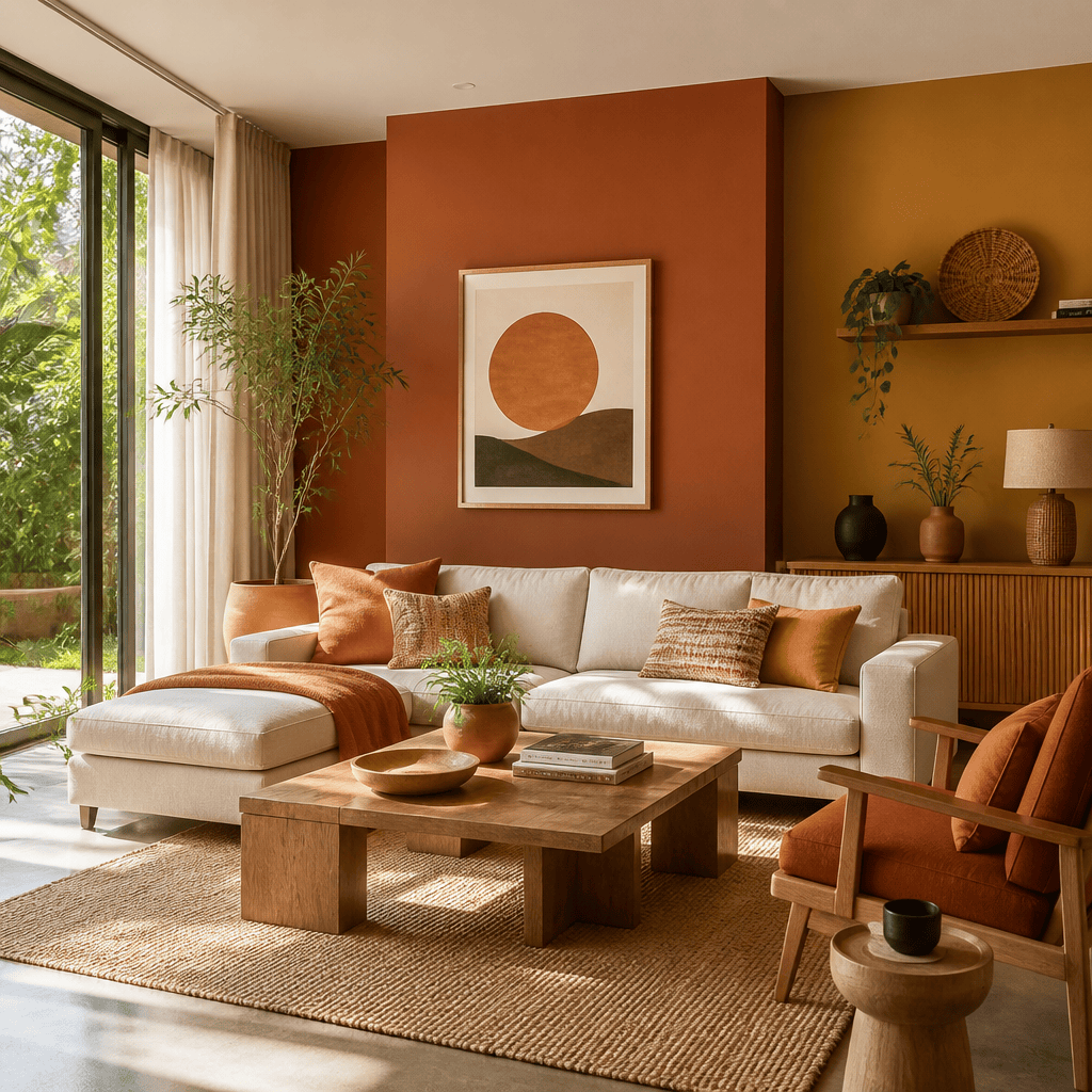
If you are still painting your living room a cool, stark gray, you are already behind. Across Greater Vancouver, the Fraser Valley, and communities like Surrey, Langley, and Abbotsford, homeowners are making a decisive move toward warmer, nature-driven palettes that feel genuinely livable year-round. Interior paint trends 2026 mark a clear departure from the cold, minimal looks that defined the past decade, and the shift is showing up in nearly every home Dreamscape Painting Ltd. walks into for an estimate. Understanding what is driving these choices, and how to apply them correctly, makes the difference between a paint job that feels fresh for a season and one that feels right for years.
Table of Contents
- Why 2026 Colour Trends Matter for BC Homes
- Quick Takeaways
- The Colours Dominating Vancouver Interiors Right Now
- Finishes and Techniques Gaining Ground in 2026
- How BC’s Climate Shapes Colour Decisions
- Comparing the Three Dominant 2026 Colour Approaches
- Room-by-Room Recommendations for Fraser Valley Homeowners
- Frequently Asked Questions
- References
Why 2026 Colour Trends Matter for BC Homes
Paint colour is not a cosmetic decision. It is a functional one. The wrong shade in a room with limited south-facing light can make a perfectly sized space feel like a basement. The right shade, applied correctly with the right finish, can make a modest-sized room feel generous and calm every single day. For homeowners across the Lower Mainland and Fraser Valley, where natural light varies dramatically between July and January, these choices carry real consequences for how comfortable your home feels to live in.
The 2026 trends are not arbitrary. They reflect a genuine fatigue with cold, corporate-feeling interiors and a move toward colours that respond to BC’s natural environment. Think Pacific coastal forests, mountain stone, Georgia Strait sunsets. These are not abstract design concepts. They are the actual landscapes visible from living room windows across Surrey, Langley, and Abbotsford.
Quick Takeaways
| Key Insight | Explanation |
|---|---|
| Warm neutrals are replacing cool grays | Cream, beige, and greige have overtaken stark gray as the go-to neutral for main living areas across Vancouver and the Fraser Valley. |
| Nature-inspired palettes dominate | Sage green, olive, terracotta, and warm clay reflect BC’s coastal forests and mountain landscapes, making them highly relevant to local homeowners. |
| Coastal blues remain a reliable choice | Mid-tone and deeper navy blues suit Vancouver’s coastal identity and deliver the calm, restful atmosphere homeowners consistently ask for. |
| Low-VOC paints are becoming the standard, not the exception | BC’s climate-conscious homeowners are increasingly choosing paints that improve indoor air quality, particularly for bedrooms and children’s rooms. |
| Colour drenching is gaining real traction | Painting walls, trim, and ceiling in the same or closely related tone creates enveloping, intentional rooms that photograph well and feel cohesive. |
| Accent colours are bolder but more selective | Deep plum, warm rust, and rich clay are being used on single accent walls or in smaller rooms rather than spread across entire open-plan areas. |
| Finish choice matters as much as colour | Matte and eggshell finishes are preferred for walls in 2026 because they minimize imperfections and create a warmer, less clinical look. |
The Colours Dominating Vancouver Interiors Right Now
Walk through any open house in Surrey or Langley and you will notice the same shift happening across price points and architectural styles. The cool, blue-toned grays that felt fresh in 2018 now read as dated. What is replacing them is not a single colour but a family of warm, grounded tones that share one quality: they feel like they belong in a home, not a showroom.
Warm Neutrals as the New Foundation
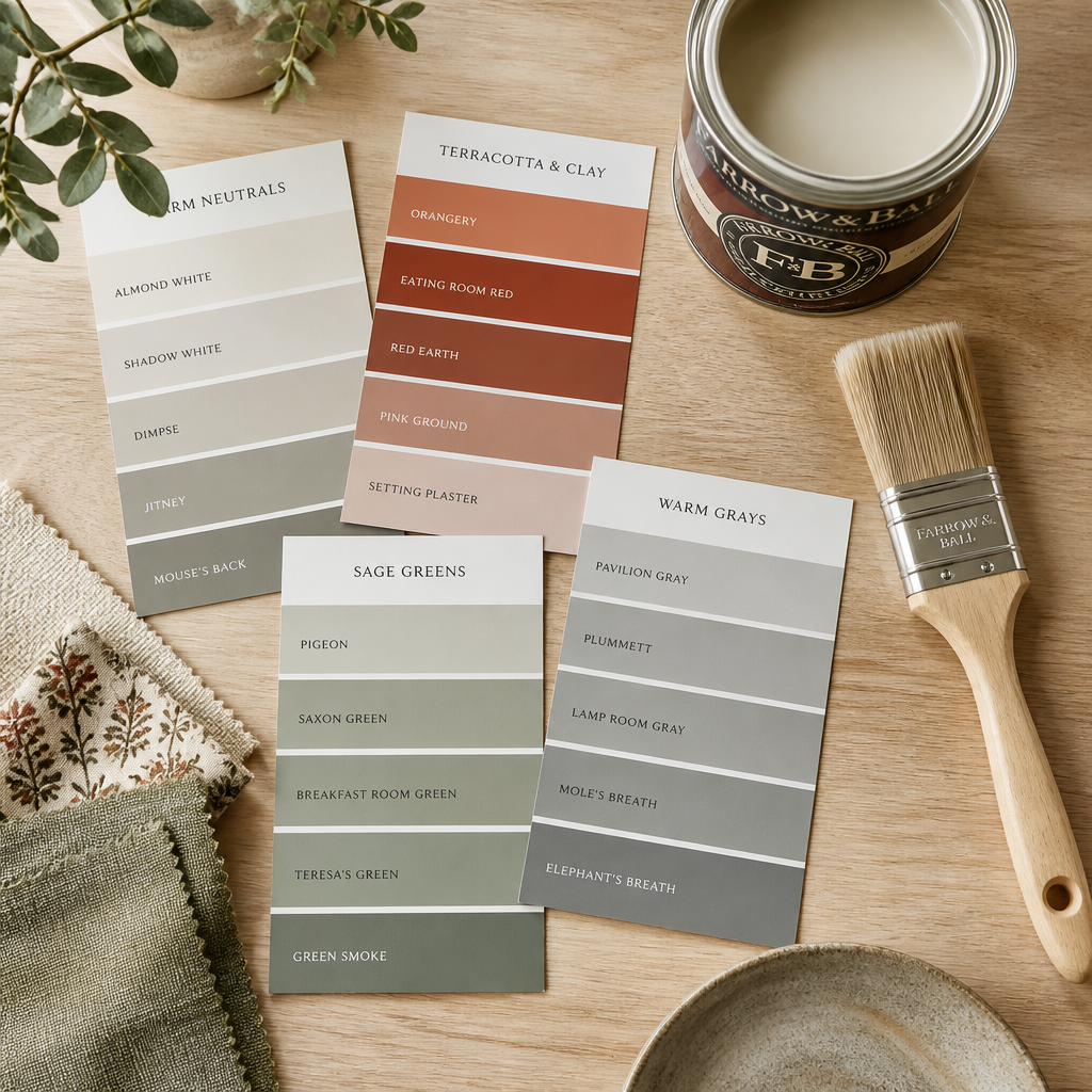
Cream, beige, and greige are the workhorses of 2026 interior painting in BC. They read as neutral without feeling cold, and they hold up under both the bright summer light and the soft, diffused light of a rainy November afternoon. In open-concept spaces, where light bounces across multiple surfaces all day, a warm neutral keeps the whole floor plan feeling connected without requiring you to commit to a single statement colour.
Greige in particular continues to be a community favourite in main living areas across Metro Vancouver. It offers the visual sophistication of gray while adding the warmth that makes a room feel genuinely inviting. For homeowners in Abbotsford and the broader Fraser Valley, where homes tend to have larger floor plans and more natural light than downtown Vancouver condos, greige works exceptionally well as a whole-home neutral.
Nature-Inspired Colours: Sage, Olive, Terracotta, and Clay
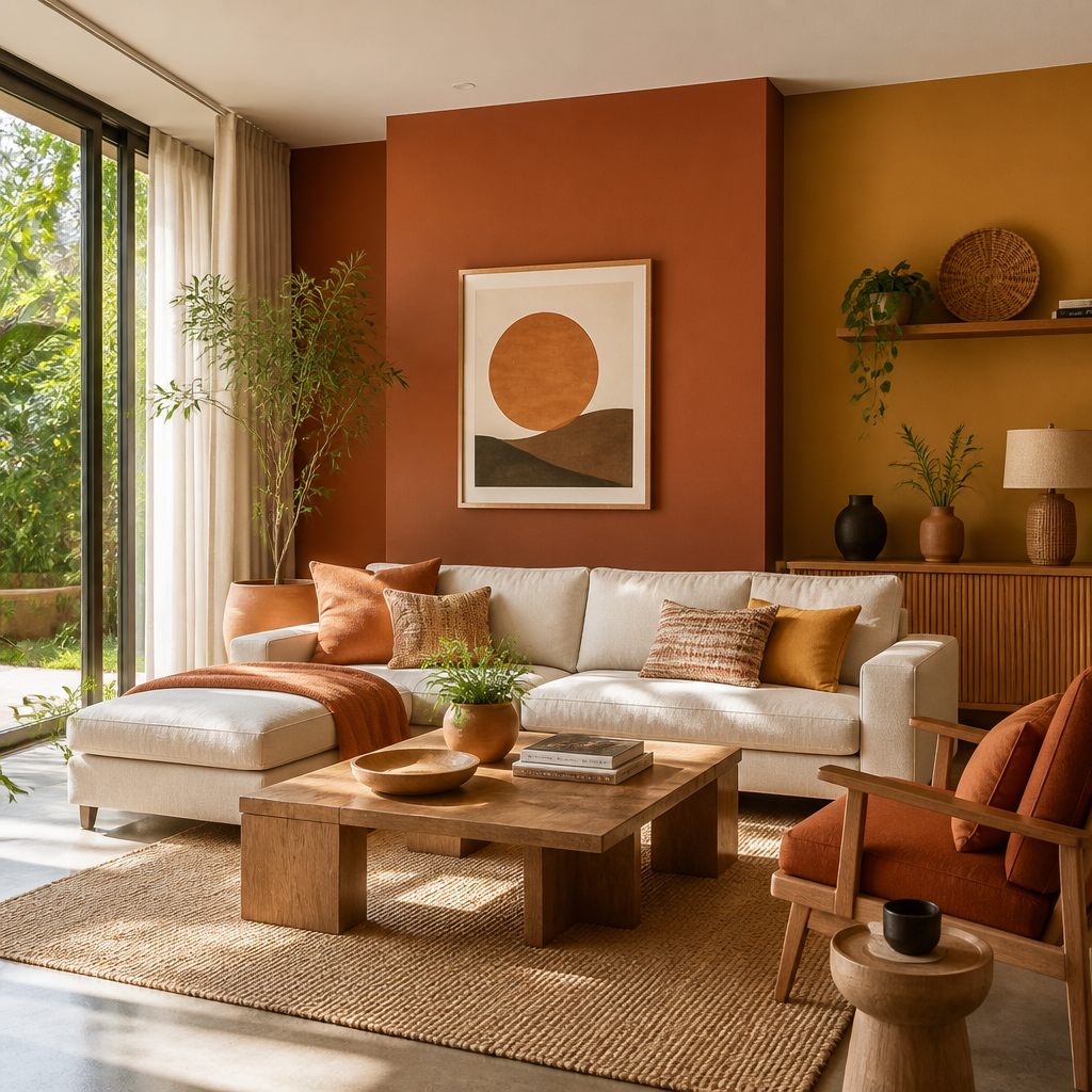
Earthy, nature-driven colours are reshaping how interior painting Vancouver projects are being designed and executed. Sage green, olive, terracotta, and warm clay are no longer reserved for feature walls or design-forward spaces. They are showing up in kitchens, dining rooms, and bedrooms as primary wall colours, often paired with natural wood tones and stone-look surfaces.
This reflects the broader biophilic design movement, where the goal is to bring the feeling of the outdoors inside. For BC homeowners, this is not a stretch. The landscape outside your window is actually that green and that earthy. These colours feel correct here in a way they might not in a prairie suburb.
Rich terracotta and warm clay deserve specific mention as accent colours. They add genuine depth and personality to a room without the visual weight of a dark navy or deep charcoal. In a dining room with warm lighting, a terracotta feature wall reads as sophisticated and layered. For a feature wall with more depth than flat paint, see our guide to fine finish painting in Vancouver.
Coastal Blues and Unexpected Accents
Blue remains a strong choice for interior painting in Vancouver, particularly in calming mid-tones and deeper navy shades. These colours are well-suited to the region’s coastal identity and deliver the tranquility that homeowners consistently ask for in bedrooms and sitting rooms. Soft sky blue works in bathrooms and laundry rooms where a light, airy feel is the goal.
Emerging accent colours for 2026 include deep plum and sophisticated muted pink tones. These work best in smaller rooms such as bedrooms and dining areas, where their intensity is contained and the effect is dramatic rather than overwhelming. Used on a single wall or in a powder room, they add an unexpected layer of depth that sets a home apart.
Pro tip: If you are drawn to a bold accent colour but nervous about commitment, test it first in a room with a door you can close. A powder room or a dining room with defined walls is far more forgiving than an open-concept living area where the colour is visible from every angle.
Finishes and Techniques Gaining Ground in 2026
Colour gets most of the attention, but finish is equally important. The right finish changes how a colour reads under different light conditions, how easy it is to clean, and how long the paint job looks fresh. In 2026, two specific approaches are standing out: a preference for matte and eggshell finishes on walls, and the growing popularity of colour drenching as a technique.
Why Matte and Eggshell Are Winning
Matte and eggshell finishes are the right choice for most wall surfaces in a BC home. They minimize surface imperfections, which matters in older homes with plaster or textured drywall, and they create a softer, warmer light reflection that suits the earthy and neutral palettes trending in 2026. High-gloss finishes reflect more light but also reveal every roller mark, brush stroke, and surface irregularity. For a warm greige or sage green, matte or eggshell is almost always the better call.
Satin and semi-gloss remain the correct choice for trim, doors, and cabinetry. The contrast between a matte wall and a satin trim sharpens the architecture of a room without requiring any bold colour choices at all.
Colour Drenching: What It Is and When It Works
Colour drenching means painting the walls, trim, ceiling, and sometimes even built-in furniture or alcoves in the same colour or closely related tones. The effect is intentional and enveloping, making a room feel like it was designed from the inside out rather than decorated after the fact.
This technique works especially well in smaller rooms where a single dominant colour creates a sense of depth and cohesion. A home office drenched in a deep sage green, with the same tone carried onto the ceiling and window casings, feels like a considered, purposeful space. In a larger open-plan area, colour drenching needs more careful planning to avoid feeling heavy.
The homes that feel most considered are not the ones with the most colours. They are the ones where every surface was chosen deliberately, and where the paint scheme holds the room together rather than competing with it.
Pro tip: When attempting colour drenching, go one shade lighter on the ceiling than on the walls. This preserves the enveloping effect while preventing the ceiling from visually dropping down onto you. It is a small adjustment that professional painters make automatically, and it makes a noticeable difference in how the finished room feels.
How BC’s Climate Shapes Colour Decisions
BC’s environment plays a direct role in which interior colours succeed and which disappoint once they are on the wall. This is not something that gets enough attention in generic trend articles written from outside the region, and it is one of the reasons local expertise matters in interior painting Vancouver projects.
Natural Light Variation Across the Year
Greater Vancouver and the Fraser Valley experience genuine seasonal light variation. The same room that floods with warm afternoon light in July can feel dim and cool in November. Colours that look bright and airy in a showroom under consistent artificial lighting can shift dramatically once they are living on your walls through a full BC winter.
Warm neutrals and earthy tones handle this variation better than cool grays and stark whites because they add their own visual warmth rather than relying on ambient light to look inviting. This is one practical reason the move away from cool gray makes sense specifically for BC homes, not just as a national trend but as a locally appropriate choice.
Humidity and Paint Selection
BC’s coastal climate brings higher ambient humidity, particularly in homes close to waterways or in areas prone to seasonal rain saturation. For bathrooms, basements, and north-facing rooms, choosing a paint formulated for humid environments prevents premature peeling and mold growth on painted surfaces. In 2026, the emphasis on low-VOC and health-conscious paint formulas aligns well with this practical need. Many of the better low-VOC options available from major manufacturers also offer improved moisture resistance.
Comparing the Three Dominant 2026 Colour Approaches
Not every homeowner comes to a painting project with the same goal. Some want a complete refresh of their colour scheme. Others want to update a single room. Some are preparing a home for sale and need broad appeal. The table below compares the three approaches most commonly requested from professional painters in BC right now.
| Approach | Best For | Key Considerations |
|---|---|---|
| Warm Neutral Whole-Home Palette (cream, greige, warm white) | Homes being prepared for sale, open-concept floor plans, families who want flexibility to change decor over time | Requires careful undertone selection, as warm neutrals can read pink, yellow, or orange depending on the specific light in your home. Always test on the actual wall before committing. |
| Nature-Inspired Accent Strategy (sage, terracotta, olive on feature surfaces) | Homeowners who want personality and warmth without committing to bold colour throughout, rooms with defined architectural features | The accent colour must be chosen in relation to the surrounding neutral, not in isolation. A terracotta that looks rich on a chip can read orange or brown once it is surrounded by the wrong white. |
| Colour Drenching (single room in one deep tone) | Home offices, dining rooms, reading rooms, powder rooms where a strong atmosphere is the goal | Works best with professional application. Uneven coverage in a drenched room is obvious because there is no contrasting trim colour to break up the surface. Prep and skill matter more here than in standard two-tone applications. |
Room-by-Room Recommendations for Fraser Valley Homeowners
Generic colour advice rarely accounts for the specific proportions and light conditions found in Fraser Valley homes. Abbotsford, Langley, and Surrey tend to have larger single-family homes with bigger rooms than you will find in a downtown Vancouver condo, which changes how colours behave on the wall. A deep sage green that feels cozy in a 10-by-12-foot condo bedroom can feel cavernous in a 14-by-16-foot master bedroom with a vaulted ceiling.
Living Rooms and Open-Plan Areas
For large, open-concept main floors, warm neutrals are the right call in 2026. They read as fresh without being trend-dependent, and they give furniture, flooring, and textiles room to breathe. The goal is for the paint colour to feel like part of the architecture rather than a decorating decision layered on top of it. Popular paint colours in BC for these spaces tend to have a slight warm or peachy undertone that holds up well across the full range of seasonal light.
Kitchens and Dining Rooms
Kitchens are seeing a strong move toward warm whites and soft off-whites on walls, paired with sage or olive accents on islands or built-in shelving. In dining rooms, this is where bold accent colours make the most sense. A deep, warm terracotta or a sophisticated muted plum in a dining room creates an intimate atmosphere that works with candlelight and evening meals without overwhelming daytime use.
Bedrooms
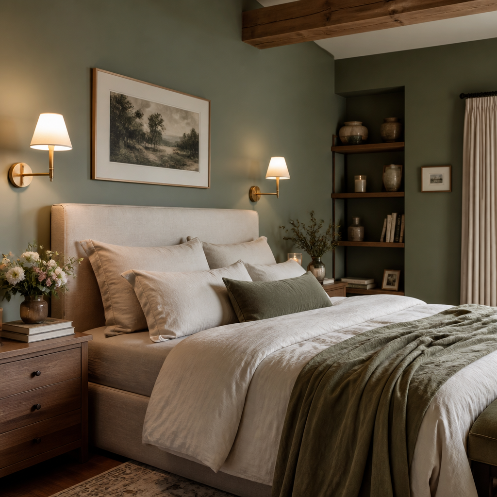
Calming mid-tone blues and soft greens are consistently chosen for bedrooms across BC. They promote rest, which is the actual function of the room. Avoid anything with a strong yellow or orange undertone in a bedroom, particularly in rooms that get morning sun. What feels energizing in a kitchen becomes disruptive in a space designed for sleep.
For children’s rooms, low-VOC formulations are the professional standard. The paint is going on walls in a room where children sleep, breathe, and spend significant time. There is no reason not to use the healthiest available option.
Home Offices
The post-pandemic home office is now a permanent fixture in most Fraser Valley homes, and homeowners are treating these spaces seriously. Colour drenching in a deep green or a sophisticated warm navy is a strong choice for a home office. It creates a defined, purposeful atmosphere that signals this is a working space, not a spare bedroom with a desk in it.
A common mistake in home offices is defaulting to the same neutral used throughout the rest of the house. The office is a distinct functional space and benefits from a colour that supports concentration and signals a mental shift into work mode.
Pro tip: Before finalizing any interior paint colour, look at the large paint chip, not the small one, in the actual room at three different times of day: morning, midday, and evening with your standard interior lighting on. The colour you see on a small chip in a paint store is almost never the colour you will see on a full wall in your home.
Frequently Asked Questions
Are warm neutrals really replacing cool grays across BC homes?
Yes, and the shift is clear. Across Metro Vancouver, Surrey, Langley, and Abbotsford, paint colour consultants and professional painters are consistently reporting that homeowners are moving away from blue-toned grays toward creams, beiges, and greiges with warm undertones. Cool gray had a long run as the dominant neutral, but it reads as dated in most BC home interiors right now.
What is colour drenching and is it a trend worth trying?
Colour drenching is the practice of painting walls, trim, and ceiling in the same colour or closely related tones throughout a single room. It creates an enveloping, cohesive effect that feels intentional rather than accidental. It is worth trying in a defined room like a dining room, office, or powder room. It requires careful surface preparation and skilled application, because every imperfection shows when there is no contrasting trim colour to draw the eye away.
How do I choose a paint colour that will work in both summer and winter light in BC?
Choose warm over cool. Warm neutrals and earthy tones hold their visual warmth even under the soft, diffused light of a BC winter, whereas cool grays and stark whites can feel stark and cold by November. Always test your chosen colour on the actual wall, at full paint chip size or larger, across multiple times of day and in different seasonal light conditions before committing to a full room.
What paint finishes are professionals recommending for BC homes in 2026?
Matte and eggshell finishes on walls, satin or semi-gloss on trim and doors. Matte and eggshell minimize surface imperfections and create the warmer, softer light reflection that suits the earthy and neutral palettes trending in 2026. High-gloss on walls is rarely the right call unless you are working with a very specific design intent in a very specific room, such as a lacquered kitchen.
Do I need low-VOC paint in my BC home?
For any occupied room, particularly bedrooms and children’s rooms, low-VOC paint is the right choice. BC’s climate-conscious homeowners are increasingly requesting it, and most professional painters now offer it as the standard option rather than an upgrade. Beyond the health benefits, many low-VOC formulations in 2026 offer comparable or better durability and coverage than older formulations, so there is no practical reason to avoid them.
Which rooms benefit most from the 2026 nature-inspired palettes?
Living rooms, dining rooms, and kitchens benefit most from the earthy, nature-inspired palettes dominating 2026 trends. These are the spaces where BC homeowners spend the most time together, and a sage green, warm terracotta, or olive tone creates the calm, grounded atmosphere that pairs naturally with the wood floors, stone countertops, and natural textures common in Fraser Valley and Lower Mainland homes. Bedrooms benefit more from the calming blue and soft green tones within the same nature-inspired family.
We would genuinely like to hear what colours you are considering for your home this year and whether any of these 2026 trends match what you have been drawn to. Share your thoughts or questions in the comments below.
References
- Vancouver homeowner’s guide to interior paint colour trends for 2026, covering earthy hues and colour drenching techniques
- Interior paint colour trends for BC homes in 2026, including the influence of the local climate on colour choices
- Popular interior paint colours set to define Vancouver homes in 2026, from warm neutrals to bold accent shades

