

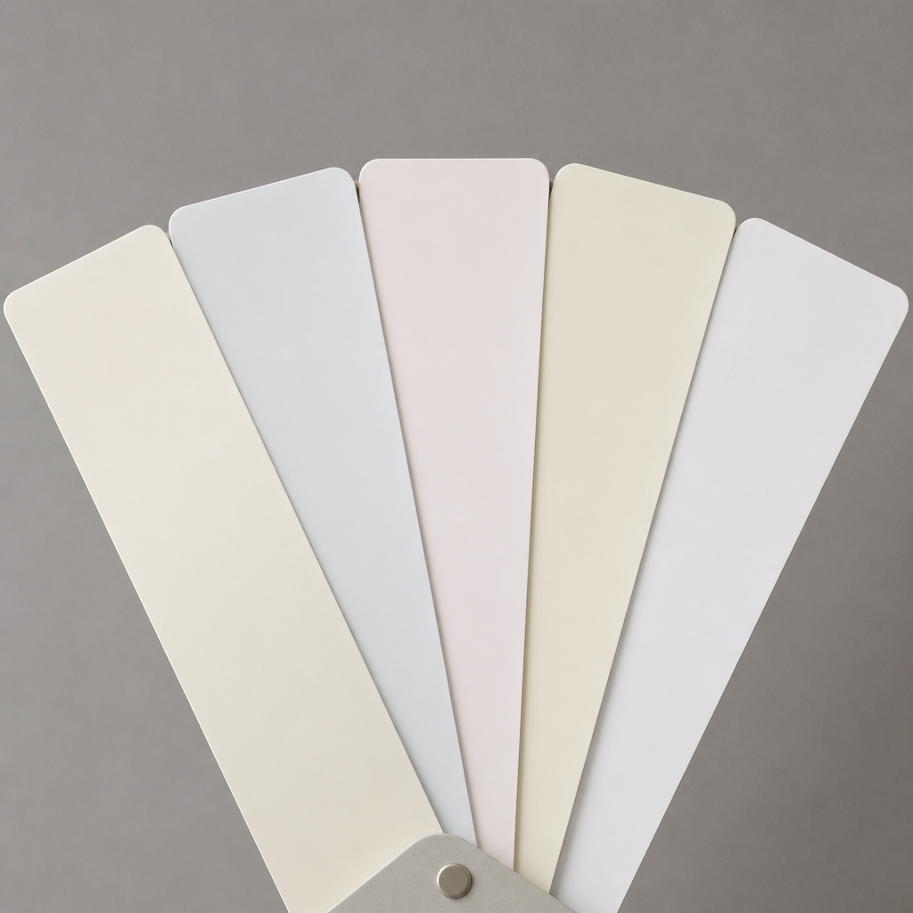
You walk into the paint store, grab a handful of white swatches, hold them up to the wall, and think: they all look the same. Three weeks later, your freshly painted living room has an unexpected green tinge, or a sickly yellow cast you never saw coming, and you are staring at a very expensive mistake. Choosing the best white paint for interior walls is genuinely one of the trickiest decisions in home decorating, and most homeowners underestimate it. This guide cuts through the confusion so you can make a confident choice the first time, whether you are repainting a single bedroom in Abbotsford or refreshing an entire home in Langley. If you would rather hand it off, see our interior painting services.
Table of Contents
- Quick Takeaways
- Why White Paint Is So Hard to Choose
- Understanding White Paint Undertones
- How Lighting Changes Everything
- How to Properly Sample White Paint
- Popular White Paint Colours Worth Knowing
- Choosing the Right Finish for White Walls
- Warm vs. Cool vs. True White: A Comparison
- Frequently Asked Questions
- References
Quick Takeaways
| Key Insight | Explanation |
|---|---|
| All whites have undertones | Every white paint contains a base pigment, yellow, pink, blue, green, or gray. That undertone becomes very visible once it covers an entire wall. |
| Light direction is the single biggest variable | North-facing rooms read cool and flat. South-facing rooms run warm and bright. Your white paint choice must work with your room’s natural light, not against it. |
| Test on the actual wall, not a swatch card | Paint chip cards in the store are tiny, surrounded by other whites, and lit by artificial fluorescent light. None of that matches your home. |
| Look at the darkest shade on the swatch strip | The lightest tint at the top of a paint strip all looks the same. The deepest shade at the bottom reveals the true undertone hiding in the white. |
| Finish affects how white reads | A flat white absorbs light and looks softer. A satin or semi-gloss white reflects light and can intensify undertones, sometimes dramatically. |
| Your existing fixtures and flooring matter | Warm wood floors amplify warm undertones. Cool gray tile amplifies cool ones. Always assess swatches next to your fixed elements, not just bare wall. |
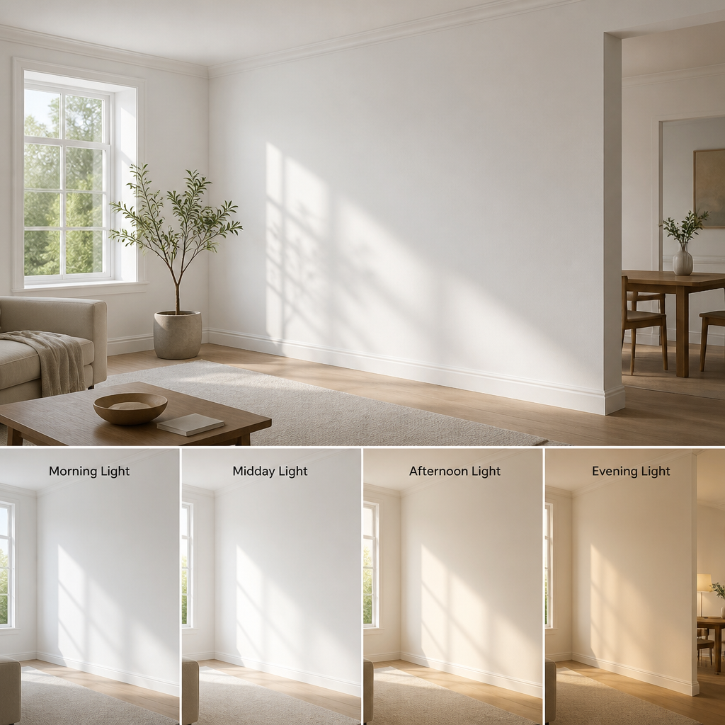
| Observe samples at multiple times of day | A white that looks crisp at noon can turn lavender at dusk or dingy under evening lamplight. Check your sample in morning light, afternoon light, and with lights on. |
Why White Paint Is So Hard to Choose
White seems like a safe, neutral choice. It is anything but. The challenge is not finding a white you like on a chip. The challenge is predicting how that white will behave across an entire room, at different hours of the day, next to your furniture, your floors, and your fixed finishes. Most people get surprised because they are evaluating colour on a 2-inch strip under store lighting. That tells you almost nothing.
Professional painters see this confusion every week. A homeowner picks a white that looks bright and clean in the store, only to discover it pulls strongly green once it fills the walls of their kitchen. Or they choose a warm ivory that looks beautiful on the chip but turns muddy next to cool-toned stone countertops. These are not failures of taste. They are failures of the sampling process.
The good news: there is a reliable method. Once you understand undertones, lighting, and how to test a sample properly, the decision becomes manageable. Here is exactly how to work through it.
Understanding White Paint Undertones
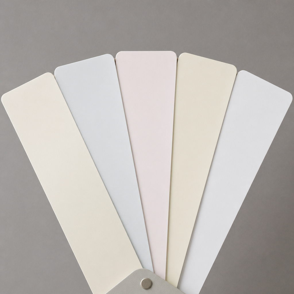
Every white paint is made with a base pigment that creates a subtle colour cast. That cast, called an undertone, is what separates one white from another. The main undertone families are warm (yellow, cream, pink, red), cool (blue, green, gray, violet), and neutral (a blend that tries to sit in the middle).
How to Actually See the Undertone
The quickest trick is to look at the darkest shade on the paint strip, not the lightest. The pale top chip is so diluted that most whites look nearly identical. The deepest shade in that same colour family shows you exactly what pigment is doing the heavy lifting. A strip that reads deep khaki at the bottom has yellow-green undertones. One that reads deep periwinkle has blue undertones.
The second trick is to hold two or three white swatches directly next to each other. Contrast makes undertones visible. A white you thought was neutral will suddenly reveal its pink or green bias the moment you put it beside a warmer or cooler white.
Warm Undertones: Yellow, Cream, Pink
Warm whites have undertones of yellow, peach, or red. They feel inviting and cozy, which makes them popular choices for living rooms, bedrooms, and any space where comfort matters more than crispness. The risk with warm whites is that they can read as dirty or yellow in rooms that already receive warm, amber-toned artificial light. If your evening lighting runs golden, test your warm white under those bulbs before committing.
Cool Undertones: Blue, Green, Gray
Cool whites carry hints of blue, green, or gray. They give a room a clean, modern, airy feel and work well in bright, south-facing rooms where warm sunlight balances the cooler base. The risk is that in a room with limited natural light, a cool white can read flat, cold, or institutional. North-facing rooms and basements are dangerous territory for cool whites unless you are very deliberate about it.
Neutral and True Whites
True whites aim for balance, with no single undertone dominating. These are often described as “crisp” or “bright” by paint brands. They work in many settings but are not magic bullets. Even a so-called true white will shift depending on the light it sits in. Do not assume neutral means problem-free.
The undertone is not a flaw in the paint. It is a feature of how pigment and light interact. The only mistake is ignoring it.
How Lighting Changes Everything
Lighting is the most important factor in choosing white paint, and it is almost always underweighted. The direction your windows face determines the quality and colour temperature of the light that fills your room throughout the day, and that light will interact with your paint’s undertone in very specific ways.
North-Facing Rooms in the Fraser Valley
Rooms without direct southern exposure receive cooler, more diffuse light. That cool, gray-toned light will amplify any cool undertones already in your white paint, making a blue-toned or gray-toned white feel especially cold or flat. The standard advice from painting professionals: in a north-facing room, choose a white with warm undertones, yellow or soft cream, to counterbalance that cool light and make the space feel inhabited rather than clinical.
South-Facing Rooms
South-facing rooms receive abundant, warm, direct sunlight for much of the day. A warm white in this setting can sometimes push into territory that feels too yellow or creamy. A cool-undertone white works well here because the warm light softens it and brings it into balance. The result is a clean, bright room that never tips into sterile.
East- and West-Facing Rooms
These rooms are the most complex because the light shifts dramatically throughout the day. East rooms are warm in the morning and cooler by afternoon. West rooms do the opposite. The practical approach for these rooms is to test your sample at multiple times of day, not just once, and choose a white that reads acceptably across that full range rather than perfectly at one moment.
Artificial Light Matters Too
Do not ignore your bulbs. Warm LED or incandescent lighting intensifies warm undertones. Cool-spectrum LEDs intensify cool ones. If your home is lit primarily with warm bulbs, a cream white can read distinctly yellow by evening. Check your sample under the same lighting conditions the room will actually be used in.
Pro tip: Paint a large sample board, at least 12 by 12 inches, with two coats of your chosen white and prop it vertically against the wall. Check it in morning light, afternoon light, and under your evening artificial lights before making your final decision. A small swatch taped to the wall rarely shows you what a full room will look like.

How to Properly Sample White Paint
Most homeowners sample white paint incorrectly, and then wonder why the finished room surprised them. The process matters more than you might expect.
Apply Two Full Coats
One coat of a paint sample is not enough. Paint dries darker than it applies wet, and a single thin coat lets your existing wall colour bleed through and skew your perception. Always apply two coats, letting the first dry completely before adding the second. The colour you see after two fully dried coats is the colour you are actually buying.
Test on Multiple Walls
Light enters a room from one direction, which means different walls receive it differently. A white that looks perfect on the wall facing the window may look much darker and cooler on the opposite wall. Apply your sample to at least two walls, including a corner or shadowed area, to see the full range of how the colour will behave in that room.
Compare Against Your Fixed Elements
Your flooring, countertops, trim, and cabinet colours are not going anywhere. Hold your sample board against your flooring. Place it next to your trim. The interaction between your white paint and your existing fixed elements is where most surprises happen. A warm white that you love in isolation can fight with cool-toned stone tile. A cool white that reads elegant can look washed-out next to natural maple floors.
Keep a White Border
When painting your sample board, leave a narrow white border around the sample. This gives your eye a neutral reference point so you are evaluating the colour in isolation rather than against your existing wall colour, which can skew perception significantly, especially if you are painting over a saturated or dark tone.
Pro tip: If you are repainting over a dark or bold colour, lightly prime the sample area before testing your white. Without primer, the existing colour bleeds through and makes even a solid white look duller than it will be with proper preparation. Dreamscape Painting’s team always primes before applying light colours over dark ones for exactly this reason.
Popular White Paint Colours Worth Knowing
You do not need to wade through hundreds of whites if you understand what you are looking for. A few colours consistently earn their popularity because they perform reliably across a wide range of homes and lighting conditions. Here are some worth understanding, grouped by character rather than brand, so you can apply the knowledge regardless of which paint brand you are working with.
Warm Creamy Whites
Colours in this family, such as Sherwin-Williams Alabaster, have become consistently popular for good reason. They sit in the sweet spot between a true neutral and an obvious cream, with enough warmth to feel welcoming without reading yellow or dated. Alabaster, for example, has a light reflectance value of around 82, which is bright enough for most rooms without feeling stark. Similar warm-leaning whites from Benjamin Moore, such as White Dove, offer a soft warmth with a subtle gray grounding that keeps them from tipping into pure cream.
Clean Crisp Whites
If your space has strong natural light and you want a fresh, modern feel, colours like Benjamin Moore Chantilly Lace or Sherwin-Williams High Reflective White are worth testing. These read very close to pure white, with minimal undertone. The trade-off is that they can feel cold in lower-light conditions and may show every imperfection on the wall surface more visibly than softer whites.
Whites with Gray or Greige Undertones
Colours like Sherwin-Williams Shoji White sit in a quiet category: white enough to feel clean, but grounded enough not to fight with other neutral tones in the room. These are often described as the “safe” choice for open-plan homes where the same wall colour runs through multiple zones with different lighting conditions. They rarely clash, though they also rarely wow.
The right answer depends on your specific room. In practice, what works in a bright south-facing Surrey kitchen may be exactly wrong for a north-facing Abbotsford bedroom. This is why testing matters more than brand loyalty. The same goes for kitchens: see our cabinet refinishers.
Choosing the Right Finish for White Walls
Undertone is only half the decision. The sheen level of your white paint affects how the colour reads in your room just as much as the colour formula itself. A white in flat finish versus the same white in semi-gloss will feel like two entirely different colours in the same space.
Flat and Matte: The Softest Option
Flat and matte finishes absorb light rather than reflecting it. This makes white walls look softer, more dimensional, and more forgiving of surface imperfections, textured drywall, small dents, uneven surfaces. The trade-off is cleanability. Flat white marks easily and cannot be scrubbed without damaging the finish. Best used in low-traffic areas: bedrooms, formal dining rooms, ceilings.
Eggshell: The Practical Everyday Choice
Eggshell has a very low sheen, just enough to provide some durability without the visual harshness of a higher-gloss finish. It is widely regarded by painting professionals as the best all-round choice for interior walls in living rooms, hallways, and family spaces. It wipes down reasonably well and does not amplify wall imperfections the way satin or semi-gloss can.
Satin and Semi-Gloss: For High-Traffic and Trim
Satin and semi-gloss finishes reflect noticeably more light, which intensifies the undertone in your white paint. If your white has a subtle green undertone and you apply it in semi-gloss, that green will become much more obvious. These finishes are most appropriate for trim, doors, cabinets, and rooms that need regular cleaning, such as kitchens and bathrooms. They are generally not the best choice for large wall areas in white unless you specifically want that high-contrast, glossy look.
Warm vs. Cool vs. True White: A Comparison
| White Type | Best Room Conditions | Risks to Watch For |
|---|---|---|
| Warm White (yellow, cream, pink undertones) | North-facing rooms, low natural light, bedrooms, living rooms seeking coziness, rooms with cool-toned tile or stone | Can read yellow or dated under warm artificial light. May clash with cool-toned countertops or gray flooring. |
| Cool White (blue, green, gray undertones) | South-facing rooms with abundant warm sunlight, modern or minimalist interiors, rooms with warm wood tones that need balance | Feels cold and flat in north-facing or low-light rooms. Can look clinical in bathrooms without warm accessories. |
| True or Neutral White (minimal dominant undertone) | Open-plan spaces with mixed light exposure, rooms that transition between zones, spaces with a wide mix of fixed finishes | Not as versatile as it seems. Will still shift under strong light. Can look stark and unfinished without careful trim and accessory choices. |
Frequently Asked Questions
What is the best white paint for interior walls in a north-facing room?
North-facing rooms receive cool, diffuse light that amplifies blue and gray undertones. The best approach is to choose a white with warm undertones, something in the cream, soft yellow, or gentle ivory family. This counterbalances the cool ambient light and keeps the room from feeling cold or flat. Warm whites from both major paint brands consistently perform well in this context. Always test two coats on your actual wall before committing.
How do I identify the undertone in a white paint swatch?
Look at the darkest shade at the bottom of the paint strip, not the lightest chip at the top. The lightest tints all look similar when diluted. The deepest shade in that same colour family reveals the undertone clearly. You can also hold two or three white swatches side by side, as the contrast between them makes undertones immediately visible. A white that seemed neutral will often reveal pink, green, or gray bias when compared directly with another white.
Should I use the same white paint throughout my entire home?
Using a single white throughout connected spaces creates visual flow and makes open-plan areas feel cohesive. However, the same white will look different in rooms with different light exposures, so test it in each major room before deciding. In practice, many homeowners use one warm white for main living areas and a slightly crisper white for trim and ceilings, which creates subtle contrast that defines architectural details without jarring colour shifts.
Is flat, eggshell, or satin finish better for white walls?
For most interior walls, eggshell is the most practical choice. It has enough durability to clean with a damp cloth, and its low sheen does not aggressively amplify undertones the way satin or semi-gloss does. Flat finish looks beautiful and hides surface imperfections well, but it is harder to clean and best reserved for low-traffic areas like bedrooms. Satin and semi-gloss are generally better suited to trim, doors, and cabinets rather than large wall surfaces painted white.
Can I just use the brightest white available to make my room feel larger?
Not necessarily. A very high-reflectance, stark white can actually make a room feel harsh and smaller if the light is not right, because strong reflected light flattens shadows and removes the depth that makes spaces feel interesting. A soft warm white or a white with a subtle undertone often makes a room feel more open and airy than the brightest possible white because it works with the room’s light rather than overriding it. Brightness is about light management, not just paint formula.
How many sample colours should I test before deciding?
Three to five samples is enough if you approach it systematically. Choose one warm white, one cool white, and one neutral white, then narrow down from there. Testing more than five at once tends to create decision fatigue rather than clarity. Apply two full coats of each sample on the actual wall, observe them at different times of day, and eliminate rather than add. The sample that consistently reads the way you want across morning, afternoon, and evening light is your answer.
Do I need to repaint my trim if I change my wall white?
Often yes, and this is something many homeowners do not anticipate. When you change your wall white, the trim colour that looked fine before may suddenly read yellow, gray, or pink by comparison. Trim and wall whites interact closely, and a shift in one frequently requires a reassessment of the other. Many painting professionals recommend choosing your wall white and trim white as a deliberate pair rather than deciding them independently.
What white paint has surprised you, for better or worse, once it went on the walls? Share your experience in the comments. The Dreamscape Painting team reads every one and we are always glad to help troubleshoot colour decisions before you commit.
References
- Step-by-step guide to choosing white paint by room lighting and undertone
- How to identify undertones in white paint and select the right shade for interior walls
- Sherwin-Williams guidance on using white paint and matching undertones to room lighting
- How to test paint colour samples accurately before committing to a colour
- In-depth breakdown of popular Benjamin Moore white paint colours and their undertones

