

Most homeowners pick paint colours the same way: they hold up a fan deck, squint at it under store lighting, and go with their gut. That approach works out roughly half the time. The other half, they end up with a bedroom that feels tense instead of restful, or a living room that looks beautiful in the showroom sample and completely flat on four walls. Colour psychology for interior painting is the discipline that closes that gap. It connects what research tells us about how colour affects the nervous system to the practical decisions every homeowner makes when refreshing a space. At Dreamscape Painting, after 35 years of transforming homes across Abbotsford, Langley, Surrey, and the Fraser Valley, we have watched colour choices make or break an interior more times than we can count. This guide gives you a framework for getting it right the first time. Ready to paint? See our house interior painting.
Table of Contents
- Quick Takeaways
- What Is Colour Psychology and Why Does It Matter in Your Home?
- Warm vs. Cool Colours: The Foundation of Every Colour Decision
- Room-by-Room Colour Guide: Matching Paint to Purpose
- Light, Finish, and Undertone: The Three Variables Most Homeowners Ignore
- Colour Comparison: Choosing the Right Approach for Each Space
- Common Colour Mistakes Homeowners Make (and How to Avoid Them)
- Frequently Asked Questions
- References
Quick Takeaways
| Key Insight | Explanation |
|---|---|
| Warm colours raise energy levels | Reds, oranges, and warm yellows stimulate appetite and conversation, making them well-suited to dining rooms and kitchens but risky in bedrooms where rest is the goal. |
| Cool colours calm the nervous system | Blues and greens are linked to lower heart rate and reduced stress, which is why they work so well in bedrooms and home offices where focused calm is needed. |
| Lighter shades open up a room visually | Lighter colours make a space feel larger and more open, while darker shades create intimacy but can shrink a room visually if misapplied. |
| Undertones matter more than the base colour | A “white” with pink undertones reads completely differently from a “white” with green undertones under the same lighting. Test every colour on your actual walls before committing. |
| Paint finish changes the psychological effect | Matte finishes absorb light and feel softer. Satin and semi-gloss reflect light and make the same colour feel crisper and brighter, which changes the mood of the room. |
| Green suits almost every room | Because green sits in the middle of the light spectrum, your eyes do not have to adjust to it, which is why it feels consistently calming and easy to live with across different spaces. |
| Accent walls can deliver mood without commitment | A bold colour on a single feature wall delivers its psychological effect without overwhelming the space, making it a good strategy for homeowners who want impact but flexibility. |
What Is Colour Psychology and Why Does It Matter in Your Home?
Colour psychology is the study of how colour influences human perception, emotion, and behaviour. In a home context, it is the reason a hospital-white hallway feels clinical and cold while a warm ivory hallway in the same square footage feels welcoming. Colour affects mood not because of any single universal law, but because of a combination of physiological responses, cultural associations, and personal memory.
That said, there are consistent patterns backed by research. Paint colours mood home effects are real and measurable enough that professional designers, colour consultants, and experienced painters treat them as practical tools, not theory. The goal when applying this to your home is not to manufacture an emotion, but to stop accidentally creating the wrong one.
For homeowners in the Fraser Valley, there is an additional layer to consider. The Lower Mainland experiences significant seasonal shifts in natural light. The grey, overcast winters typical of this region mean that a colour that looks bright and cheerful in July can feel heavy and oppressive by November if it lacks warmth in its undertone. Choosing colours that hold up across seasons is a real practical concern, not just an aesthetic preference.
Warm vs. Cool Colours: The Foundation of Every Colour Decision
Every colour decision in a home starts with understanding the warm-cool divide. This is not about personal taste. It is about understanding what each category does to a room before you factor in specific hues.
What Warm Colours Do
Warm colours, which include reds, oranges, yellows, and warm neutrals like terracotta and golden beige, tend to evoke feelings of warmth, comfort, and energy. They draw people together and can make a large, cold room feel more human-scale and sociable. The risk is overstimulation. A bedroom painted in a strong warm red will feel exciting rather than restful, which is exactly the wrong outcome for most people at the end of a long day.
Red in particular is an intense choice. It has been shown to raise blood pressure and heart rate, making it a powerful tool in spaces where energy is desired, like a dining room, but a poor fit for anywhere you want to decompress. Yellow captures the warmth of sunlight and lifts mood in an uplifting, welcoming way. Used in soft, muted tones it works beautifully in kitchens, bathrooms, and hallways. Pushed to bright or saturated territory, it can cause eye fatigue over time.
What Cool Colours Do
Cool colours, including blues, greens, and violets, are consistently associated with calm, relaxation, and mental clarity. Blue is widely considered the most calming of all colours and is associated with trust, dependability, and stability. It can slow respiration and lower blood pressure, which is exactly what most people want in a bedroom or a quiet reading room.
The practical risk with cool colours is that they can read as cold or distant if overused, especially in a region like the Lower Mainland where natural light is limited for months at a time. The solution is to select blues and greens with warm undertones, or to balance them with warmer accessories and wood tones, rather than abandoning them entirely.
The colour environment you live in directly influences your mental and emotional state. Choosing paint colours that align with how you want to feel in a space is one of the most practical improvements any homeowner can make.
Pro tip: Before buying even a test pot, place a white piece of paper next to your shortlisted paint chip. The contrast will reveal the true undertone of the colour, whether it leans warm, cool, or neutral, which is the single most useful thing to know before committing to a full room.
Room-by-Room Colour Guide: Matching Paint to Purpose
The biggest mistake homeowners make is treating the whole house as one colour decision. Every room has a function, and that function should drive the colour choice. Here is how to apply colour psychology practically, room by room.
Living Room: Balancing Energy and Comfort
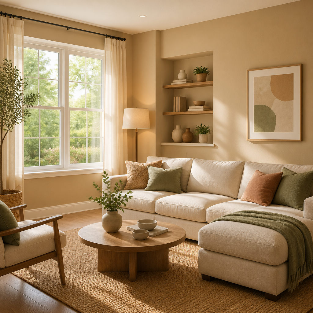
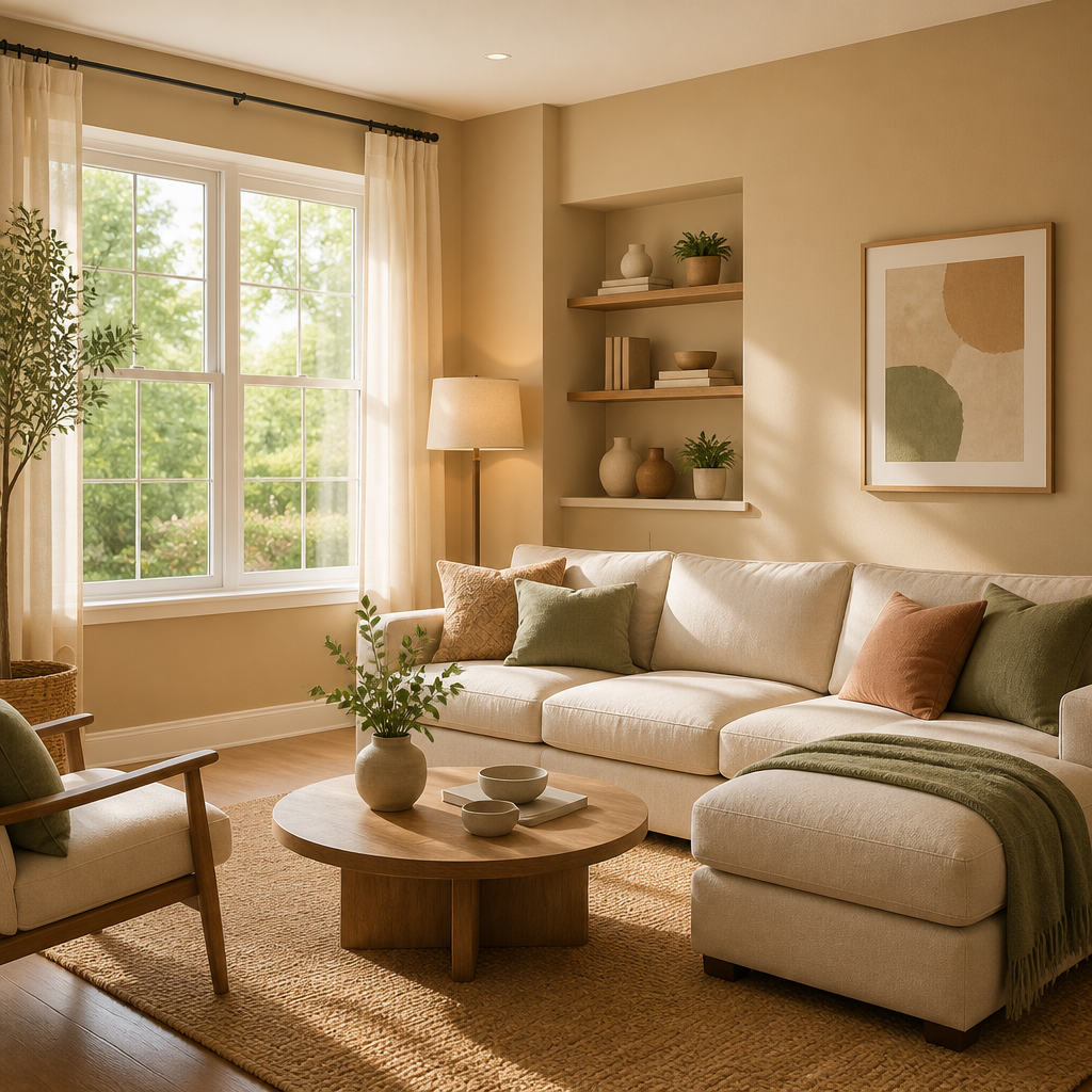
The living room is a social hub that needs to balance two competing demands: energy for hosting and gatherings, and comfort for relaxing at the end of the day. Warm neutrals, muted golds, and dusty terracottas hit that balance well. They feel welcoming without being stimulating. Bolder choices like deep olive green or navy can work in larger living rooms with good natural light, creating a rich, grounded feeling rather than an energizing one.
Avoid very bright, saturated warm colours on all four walls. They work as accent walls but become oppressive at full room scale. Stick to tones you would be happy staring at for three hours straight, because at some point you will be.
Bedroom: Prioritize Rest Above All
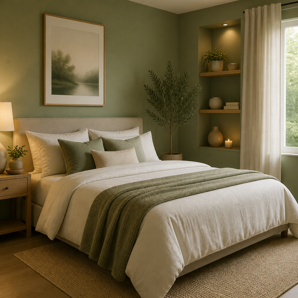
The bedroom is where cool colours earn their keep. Soft blues, muted greens, and light lavenders are consistently the best performers for promoting rest and sleep. Lighter blues feel calming and restorative, while deeper shades introduce a more cocooning, contemplative mood that works well for those who prefer a dramatic but still restful space.
Green is an especially practical choice for Lower Mainland bedrooms. Because it sits in the middle of the visible light spectrum, your eyes do not have to adjust to it in the way they do with reds or blues, making it the most effortless colour to live with over time.
Pro tip: In bedrooms, choose a colour that is at least two shades lighter than you think you want. Paint dries darker than it appears on a chip, and it will look even deeper when it covers four walls. The calming effect you are looking for depends on the colour not being overpowering.
Kitchen: Appetite, Warmth, and Cleanliness
Kitchens benefit from colours that stimulate warmth, appetite, and a sense of hygiene. Warm whites, soft creams, and pale yellows are reliable performers. They reflect light, which matters in kitchens where task lighting is critical, and they create an inviting, energetic atmosphere without becoming overwhelming. Fresh greens work well in kitchens that receive good natural light, evoking a clean, organic quality.
Avoid using blue as the dominant colour in a kitchen if appetite stimulation matters to you. Blue has a documented appetite-suppressing effect, which is the opposite of what most kitchens need.
Home Office: Focus Without Sterility
The home office needs to support concentration for extended periods. Pale blues, soft greens, and warm off-whites are the most reliable choices here. Medium and darker shades of blue have been noted to support intellectual focus and clear thinking. Light grey is highly versatile, promoting a sense of calm, organization, and focus without being cold.
The trap to avoid is painting a home office brilliant white. While it reads as clean and simple, a pure, cool white can feel clinical after several hours and causes more eye strain than a warm neutral. Warm whites and light greige tones give the same sense of openness with far less fatigue.
Dining Room: Conversation and Connection
The dining room is one of the few spaces in a home where a bold warm colour genuinely earns its place. Deep reds, warm terracottas, and rich ochres stimulate conversation and create an intimate, sociable atmosphere that makes meals feel like events. Red in particular stimulates appetite and draws people together, which is exactly the function of a dining room.
Keep saturation in check. A dusty, muted red or terracotta reads as sophisticated and welcoming. A bright, clean red reads as intense and commercial. The former is almost always the right call for a residential dining room.
Light, Finish, and Undertone: The Three Variables Most Homeowners Ignore
Colour psychology in interior painting is not just about choosing a hue from a mood chart. The emotional effect of any paint colour is shaped at least as much by the finish, the undertone, and the quality of light in the room as it is by the colour family itself.
How Natural Light Changes Everything
Natural light is the single biggest variable in how a paint colour reads in a finished room. A north-facing room in an Abbotsford or Langley home receives indirect, cooler light for most of the day. In that room, a cool grey that looks balanced in a south-facing showroom will feel distinctly cold and dark. The same grey in a south-facing room with afternoon sun can look beautiful. Need help choosing? Quotes for Abbotsford interior painting are free.
The practical fix is to test large paint swatches on the actual wall and observe them at multiple times of day, including on an overcast afternoon. That is the closest you can get to a real-world preview before you commit.
Paint Finish and the Mood It Creates
Matte finishes absorb light and make colours feel softer, quieter, and more receding. They are almost always the right choice for bedrooms and living rooms where you want the colour to wrap around you gently. Satin and eggshell finishes add a subtle sheen that makes the same colour feel crisper and brighter, which works well in kitchens and bathrooms where a sense of cleanliness matters. Semi-gloss and high-gloss finishes are primarily for trim, doors, and cabinets rather than walls, but on the right surface they make a strong, clean statement.
Undertones: The Hidden Variable
Undertone is where most homeowners get tripped up. A “greige” (grey-beige) can have pink undertones, green undertones, or yellow undertones, and each of those will produce a completely different room. The confusion usually happens because undertones only become visible once they are surrounded by other colours and lit by the room’s specific light. A pink-undertoned greige that looked warm and neutral on the chip can feel almost lavender once it covers an entire room.
Testing on the actual wall, at a sample size of at least 30 cm square, and waiting 24 hours before deciding, is the only reliable way to verify an undertone. This is not overthinking, it is the step that separates a colour choice you will love for years from one you will repaint in six months.
Colour Comparison: Choosing the Right Approach for Each Space
| Colour Strategy | Best Rooms | Psychological Effect and Practical Notes |
|---|---|---|
| Full-room cool neutral (warm-undertoned grey or greige) | Living room, bedroom, home office, hallway | Delivers calm and sophistication without coldness. Extremely versatile against different furniture and trim colours. Holds up well through Lower Mainland seasonal light changes. Best in matte or eggshell finish. |
| Full-room saturated cool (navy, deep teal, forest green) | Bedroom, dining room, study, feature room | Creates a cocooning, enveloping feeling that promotes intimacy and depth. Requires good lighting and confident execution. In small rooms, it can feel oppressive if the ceiling and trim are not treated carefully. Works best with a professional application to avoid lap marks. |
| Warm accent wall with neutral field colour | Living room, dining room, bedroom headboard wall | Delivers the mood lift and energy of a warm colour without overwhelming the entire space. Gives homeowners the ability to refresh or change the accent without repainting the full room. Works especially well in rooms that need to serve multiple functions. |
Common Colour Mistakes Homeowners Make (and How to Avoid Them)
After more than three decades of residential painting in Abbotsford and across the Fraser Valley, certain mistakes come up repeatedly. They are worth naming directly because they are all avoidable.
Choosing Colour Under Store Lighting
Paint store lighting is designed to make colours look appealing, not to replicate your home’s light conditions. A chip that looks warm and golden in a brightly lit store can look greenish or flat in a north-facing room. Always bring the chip home before buying the test pot, and always test the actual paint on your actual wall.
Painting All Rooms the Same Colour for a “Cohesive” Look
This is the most common colour mistake we see, and it consistently produces flat, featureless interiors that feel like a rental suite rather than a home. Cohesion does not mean identical. It means colours that work in the same family and transition naturally from room to room. Each room should have its own identity while relating to its neighbours through undertone and value.
Ignoring the Ceiling and Trim Colours
The wall colour does not exist in isolation. A brilliant white ceiling can make even a warm wall colour feel colder and harsher than it should. A warm off-white ceiling lowers the visual temperature of the whole room and makes the wall colour feel more intentional. Similarly, trim colour creates the frame that the wall colour sits inside. Getting both right is what separates a professional result from an amateur one.
Using Colours That Are Too Saturated for the Room’s Function
Bright, heavily saturated colours look excellent as small swatches and in magazine photographs. In a full room, they are very difficult to live with over time. Calming colours are almost always muted, slightly greyed versions of their base hue rather than pure, intense versions. The difference between a calming sage green and an exhausting lime green is saturation. Always move toward the muted side of any colour family for large surface applications.
Pro tip: If you are refreshing your home before listing it for sale, resist the urge to make strong colour statements. Universally calming, slightly warm neutrals, soft whites with warm undertones, and light greiges consistently test better with buyers across the Lower Mainland market because they read as clean, spacious, and easy to personalize. The goal in that specific context is not personal expression but broad emotional appeal.
Frequently Asked Questions
What is the single best paint colour for a bedroom if I want to improve sleep quality?
Soft blue remains the most consistently recommended colour for promoting restfulness in bedrooms. It is associated with calm, lower heart rate, and a sense of tranquillity. If a cool blue feels too stark for your space, a muted sage green or a warm greige with cool undertones will produce a similar calming effect with more visual warmth. The key is keeping saturation low and the finish matte.
Are dark paint colours ever a good idea for a small room?
Yes, but only if the goal is intimacy rather than openness. A deep, saturated colour in a small room creates a cocooning effect that can feel sophisticated and deliberate rather than cramped, as long as the lighting is sufficient and the trim and ceiling are handled carefully. If you want the room to feel larger, stick with lighter, cooler tones. If you want it to feel like a private retreat, a dark colour can be exactly right.
How do I choose paint colours that will look good through both the bright summer months and the grey Lower Mainland winters?
Choose colours with warm undertones in the mid-value range, not too light and not too dark. Pure whites and very cool neutrals that look fresh in July tend to feel cold and flat by November when the light turns grey and indirect. Warm whites, creamy off-whites, and greiges with a slight golden or peachy undertone hold up far better through the seasonal shift because the warmth compensates for the reduced light intensity.
Can I use different colours in every room, or does it make the house feel disjointed?
Different colours in each room is not only acceptable, it produces better results than a uniform palette. The key to cohesion is working within the same undertone family throughout the home. If your main living areas use warm undertones, carry that warmth through the hallways and into the bedrooms even if the specific hues change. Transitions between rooms should involve a shift in value or saturation, not a sudden switch from warm to cool, which creates a jarring feeling as you move through the home.
What paint colours work best for kitchen cabinets?
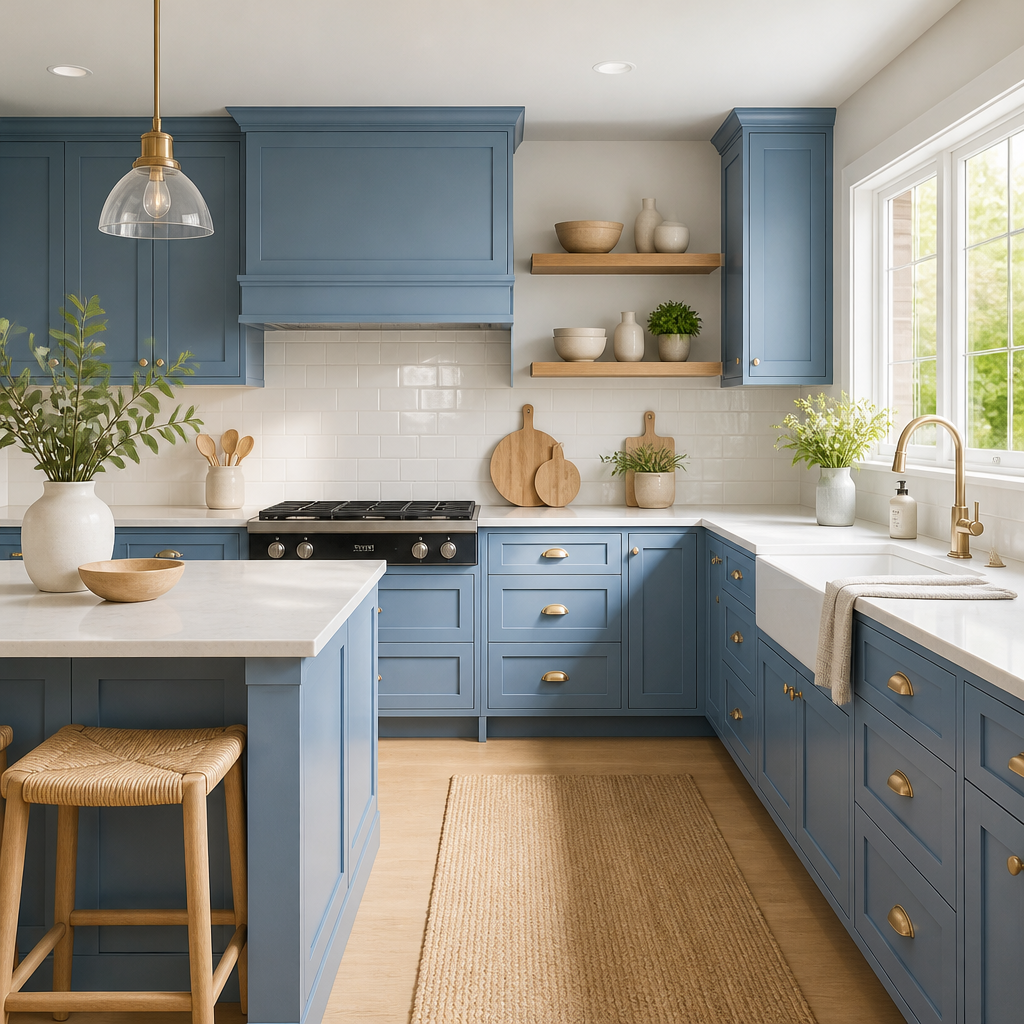
Cabinet refinishing is one of the most cost-effective ways to change the entire mood of a kitchen. Warm whites and off-whites are the most versatile choice and work in nearly any lighting condition. Deep navy and forest green have become strong performers because they add richness and ground the kitchen without being as heavy as black. Avoid very warm or saturated mid-tones on cabinets because they tend to date quickly and can fight with countertop and backsplash materials. Whatever colour you choose, the finish quality matters enormously at this scale since cabinets are touched and scrutinized up close every day.
How much does natural light affect what colour I should choose?
Natural light is the most important variable in the entire colour decision. Rooms with abundant south-facing light can handle cooler, slightly greyed colours that would feel depressing in a north-facing room. A north-facing room almost always needs a colour with warm undertones to feel inviting rather than clinical. Before you test any colour, stand in the room on an overcast day and note how much light it actually receives. That is the light condition you need your colour to succeed in, because it represents the worst case your room will face.
Have you recently repainted a room in your home using colour psychology principles? Share what worked, or what you wish you had done differently, in the comments below.
References
- How colour psychology applies to interior painting choices and room-by-room colour selection
- Room colour psychology and how different paint colours affect mood and behaviour in living spaces
- Research overview of how specific colours influence emotion and energy in residential rooms
- Practical guide to using colour to lift mood and set atmosphere in different areas of the home
- How warm and cool paint colours affect mood, perception of space, and emotional wellbeing indoors

