
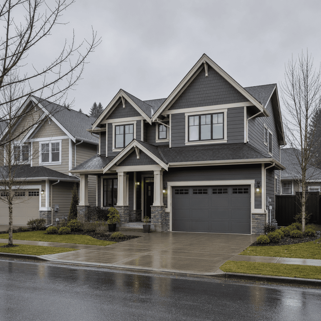
Choosing the wrong exterior paint colour is one of the most expensive mistakes a homeowner can make. In the Fraser Valley, where overcast winters, damp springs, and bright summer light create wildly different viewing conditions throughout the year, a colour that looks perfect on a paint chip can look flat or garish on your actual house. After 35 years of exterior painting across Abbotsford, Langley, Surrey, and the broader Lower Mainland, the team at Dreamscape Painting Ltd. has seen every colour choice go right and wrong. This guide gives you a practical, no-nonsense framework for choosing exterior paint colours in Fraser Valley light and conditions.
Table of Contents
- Quick Takeaways
- Why Fraser Valley Light Changes Everything
- Start With What You Cannot Change
- Understanding Undertones: The Detail Most Homeowners Miss
- Popular Exterior Colour Palettes for BC Homes
- Colour Scheme Comparison: Approaches That Work in the Fraser Valley
- How to Test Exterior Colours Before You Commit
- Working With Neighbourhood Context and Strata Rules
- The Role of Paint Sheen in Exterior Colour Perception
- Frequently Asked Questions
- References
Quick Takeaways
| Key Insight | Explanation |
|---|---|
| Fraser Valley light skews cool and grey for most of the year | Colours with warm undertones often read more neutral outdoors here, making them a safer choice for siding than they appear in a showroom. |
| Fixed elements set your colour envelope | Roof shingles, brick, stonework, and concrete foundations cannot be changed cheaply, so your paint palette must work around them, not against them. |
| Undertones are more important than the colour itself | A beige with a green undertone will clash with a brown roof. A beige with a yellow undertone may work perfectly. Always identify undertones before buying. |
| Test swatches at 12-by-12 inches minimum outdoors | Small chip samples inside a store are useless for exterior decisions. Paint large test patches and observe them at different times of day over at least two days. |
| Satin sheen is the professional standard for BC exteriors | Satin resists moisture, hides minor surface imperfections, and holds colour depth better than flat or eggshell in the wet Lower Mainland climate. |
| Three-colour schemes outperform two-colour schemes visually | Body, trim, and accent door colours create architectural definition. Two-colour schemes often make a house look flat, especially on overcast days common in Abbotsford and Langley. |
| Neighbourhood context affects perceived value | According to a Zillow analysis, exterior paint colour choices that complement surrounding homes contribute positively to curb appeal and resale interest. |
Why Fraser Valley Light Changes Everything
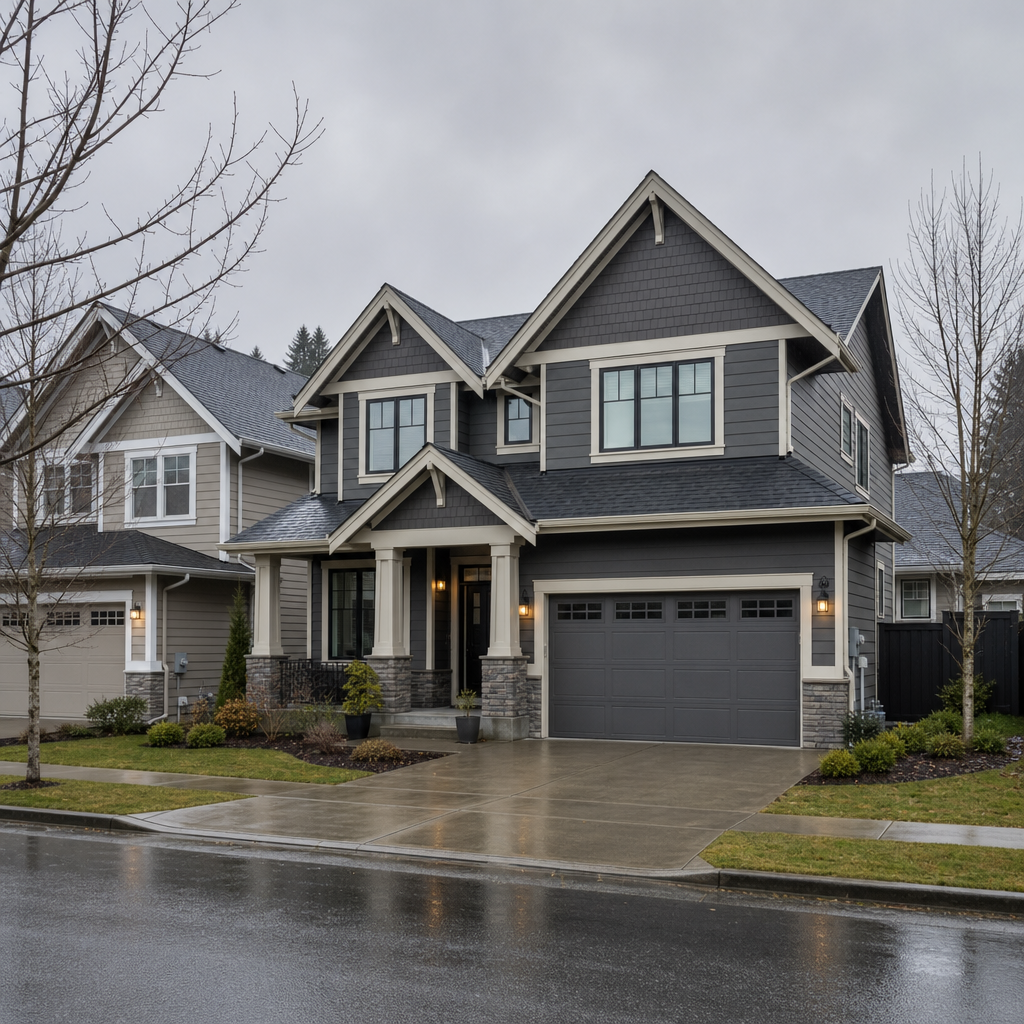
The Fraser Valley sits under a marine west coast climate. From October through April, the sky is frequently overcast, diffuse, and grey. This matters enormously when choosing exterior paint colours in the Fraser Valley because diffuse light strips warmth from colours. A creamy white that looks buttery and inviting in direct California sun will read almost grey on a Langley November afternoon.
In practice, homeowners who pick colours indoors under warm showroom lighting are almost always disappointed when they see the result outdoors. The colour appears cooler, more muted, and sometimes completely different in undertone. This is not a defective product. It is physics.
The fix is simple but takes discipline: always evaluate your shortlisted exterior paint colours outside, in natural Fraser Valley daylight, at multiple times of day. Morning light from the east and late afternoon light from the west hit your walls at different angles and temperatures. A north-facing wall may almost never see direct sun at all, which means it will always read in diffuse, cool light.
Pro tip: If your home has a north-facing front elevation, avoid very dark colours on the body. They will absorb the grey light and make the house look heavy and shadowed. Medium-value warm neutrals hold up far better in these conditions.
Start With What You Cannot Change
Before you look at a single paint chip, document every fixed element on your home’s exterior. These are the elements that will remain regardless of what colour you choose, and they define what colours will actually work.
Roof Shingles
Your roof is the single largest fixed colour element on most homes. Most Fraser Valley homes have asphalt shingles in charcoal grey, weathered brown, or blended earth tones. A charcoal roof is forgiving and pairs with almost any body colour. A warm brown roof is more restrictive. It fights cool blues and greens but sings with warm tans, greens, and creamy whites.
Brickwork, Stone, and Concrete
Many older homes in Abbotsford and Surrey have brick accents or foundations with specific undertones. Pull those undertones into your palette rather than ignoring them. A red-toned brick paired with a cool grey body creates an unresolved tension that trained eyes immediately notice and untrained eyes simply find unsettling without knowing why.
Concrete Driveways and Pathways
Concrete reads as a warm grey with yellow or pink undertones depending on the aggregate used. If your driveway is prominent, its colour will interact with your siding every time someone looks at your home from the street. This is a detail most homeowners overlook entirely.
Pro tip: Photograph your home’s fixed elements in full daylight and bring those photos to your paint supplier. Ask specifically, not generally, what undertones are present in each fixed element. A knowledgeable supplier will give you a concrete answer.
Understanding Undertones: The Detail Most Homeowners Miss
A common mistake is choosing a colour by its general category, such as grey, and assuming all greys will work together. They will not. Grey paint can carry blue, green, purple, or brown undertones. If your trim grey has a purple undertone and your body grey has a green undertone, the combination will look unintentionally mismatched.
Undertones become more visible outdoors. Inside a showroom or under warm incandescent lighting, undertones are partially suppressed. Under the cool, diffuse daylight of a Fraser Valley winter, they dominate. This is why so many homeowners are surprised by how their chosen colour looks once it is actually on the house.
How to Identify Undertones Reliably
Place your paint chip against a pure, known colour. Hold the chip against a true white surface. If the chip looks slightly yellow next to white, it has a warm undertone. If it looks slightly blue or green, it has a cool undertone. Repeat this with other chips you are considering to compare undertones directly.
For house exterior colour ideas in BC, the most reliable combinations use undertones from the same temperature family across body, trim, and accent colours. Warm-undertone body with warm-undertone trim. Cool-undertone body with cool-undertone trim. Mixing temperature families across the same surface zone creates visual noise.
“Colour is not just a personal preference on exteriors. It is a technical decision shaped by light conditions, fixed materials, and architectural proportion. Getting the undertones right is the single highest-leverage technical choice in any exterior painting project.” – Dreamscape Painting Ltd., based on 35 years of exterior projects across the Lower Mainland
Popular Exterior Colour Palettes for BC Homes
Based on projects completed across Abbotsford, Langley, Surrey, and the Fraser Valley broadly, certain palettes consistently perform well in this specific climate and housing stock. These are not trend-chasing recommendations. They are colours that hold up visually over multiple seasons and under the full range of Fraser Valley light conditions.
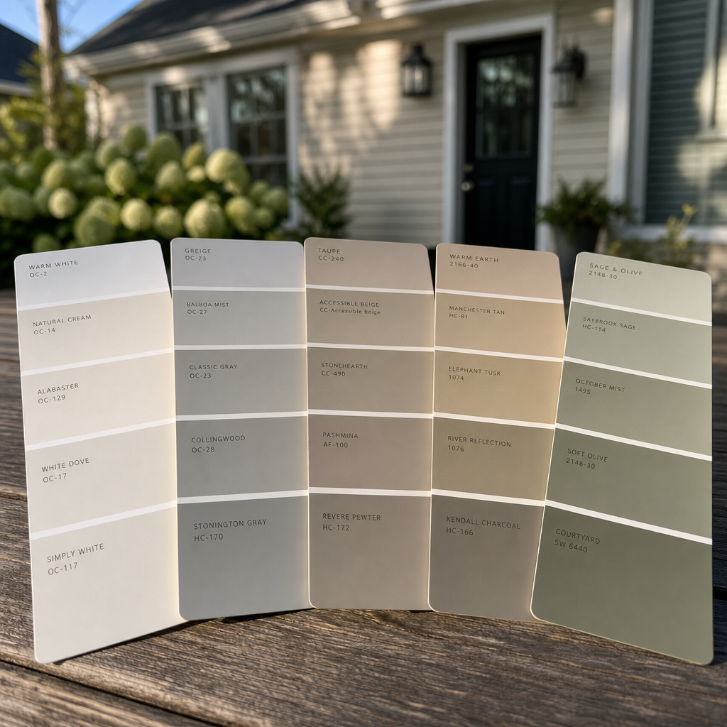
Warm Greige with Crisp White Trim
Greige, a blend of grey and beige with a warm undertone, is the most requested exterior colour in the Lower Mainland right now. It reads as sophisticated and neutral without disappearing into the grey landscape. Paired with bright white trim and a charcoal or navy accent door, it works on both modern and traditional homes. Benjamin Moore’s Revere Pewter and Sherwin-Williams’ Accessible Beige are the most common choices we see requested on exterior painting in Abbotsford projects.
Classic White with Contrasting Dark Trim
A reversal of the traditional white-body, dark-trim approach, this palette places a warm white or cream on the body with a deep charcoal or black on the trim. It is contemporary, high-contrast, and works particularly well on Craftsman and farmhouse-style homes that are common throughout Langley and Abbotsford. The key is choosing a white with a slightly warm undertone so it does not look clinical or stark under grey skies.
Soft Sage Green with Natural Wood Accents
Sage green has seen a significant surge in popularity across BC. It connects visually to the surrounding landscape, particularly in areas near agricultural land or forest edges that define much of the Fraser Valley. The data consistently shows that earth-toned exteriors, including sage greens and muted olive tones, have strong resale performance in markets with significant natural surroundings.
Colour Scheme Comparison: Approaches That Work in the Fraser Valley
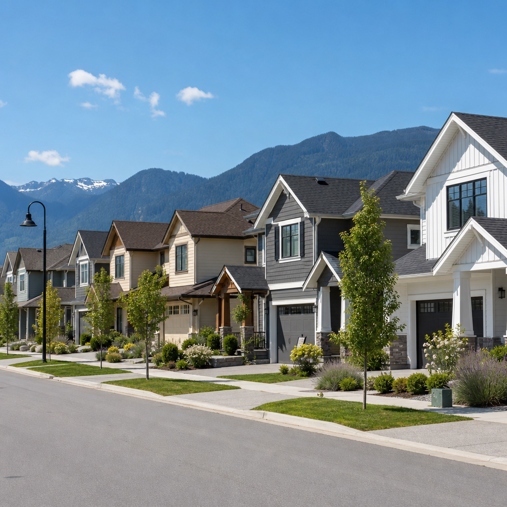
Not all colour strategy approaches are equally effective in BC’s specific light conditions. Here is a direct comparison of three common approaches homeowners use when choosing exterior paint colours for their Fraser Valley home.
| Approach | How It Works | Performance in Fraser Valley Conditions |
|---|---|---|
| Trend-First Selection (choose based on current popular colours) | Homeowner selects from current-year trending colours in design publications or social media, then tests on the home. | Inconsistent. Trending colours are often photographed in high-sun climates like California or the US Southwest. They frequently underperform in the diffuse grey light of BC, especially cool, saturated tones. |
| Fixed-Element-First Selection (start with roof, brick, stone) | Homeowner inventories all fixed exterior elements first, identifies their undertones, then selects body and trim colours that coordinate with those undertones. | Consistently strong results. This is the method used by professional painters and colour consultants. It eliminates the most common source of exterior colour regret. |
| Neighbourhood Sampling (match or complement nearby homes) | Homeowner surveys neighbouring homes, identifies common palettes, and chooses a colour that fits within the existing visual context. | Good for avoiding jarring outlier colours that harm curb appeal. Best used as a secondary filter after the fixed-element-first method has produced a shortlist. |
How to Test Exterior Colours Before You Commit
This is where most homeowners shortcut their way into expensive regret. A 2-inch paint chip under fluorescent store lighting tells you almost nothing about how a colour will look on your actual home in actual Fraser Valley weather. A proper exterior colour test takes two to three days and requires real commitment.
The Large Sample Method
Purchase sample pots of your two or three finalist colours. Paint at least a 12-by-12-inch patch on the actual exterior surface, not on cardboard or foam board held up against the wall. Different substrates absorb paint differently and will change the colour reading. Observe each patch in morning light, midday light, overcast conditions, and at dusk over two full days.
Photograph the Test Patches
Your eyes adapt to colour temperature. A photograph does not. Take photos of each test patch on your phone at different times of day. When you look at the photos side by side on your screen, the colour differences between undertones become much more obvious than when you observe them in person over time.
Also photograph the test patches alongside your roof and any fixed stone or brick elements. This gives you a preview of the full composition that no amount of digital rendering software can replicate as accurately as physical paint on your actual house.
Pro tip: If you are torn between two colours after a full test cycle, go with the lighter one. Colours always appear darker on a full house than they do on a small test patch, because large surface areas intensify colour perception. What looks like a medium grey on a test patch often reads as near-black on an entire two-storey elevation.
Working With Neighbourhood Context and Strata Rules
Many properties across Surrey, Langley, and newer Abbotsford developments are governed by strata corporations or homeowners associations that have approved colour palettes. Before you invest time in choosing exterior paint colours for your Fraser Valley home, confirm whether your property is subject to any colour restrictions.
In practice, strata-approved palettes are usually broader than homeowners expect. They typically restrict only the most extreme choices, such as bright primary colours or very dark near-black bodies, to maintain neighbourhood cohesion. Within an approved palette there is usually significant room to express individual preference through trim, accent, and door colours.
When No Strata Rules Apply
In older Abbotsford and Langley neighbourhoods with no strata oversight, you have full creative latitude. This does not mean anything goes from a practical standpoint. Homes that are dramatically out of step with their neighbours in terms of colour saturation or darkness can affect resale. Real estate professionals consistently note that extreme outlier exteriors generate comments, and comments from buyers are not typically positive ones when it comes to unconventional colour choices.
A useful rule is to stay within two steps of value (lightness or darkness) compared to the immediate neighbouring homes. This allows you to be distinct without creating a visual disruption on the street.
The Role of Paint Sheen in Exterior Colour Perception
Sheen level changes how a colour reads outdoors more than most homeowners realize. A flat finish absorbs light and makes colours appear muted and chalky, which is rarely the intention. A high-gloss finish reflects light and creates glare that can actually distort the colour you see, especially on overcast days when there is soft ambient light coming from multiple angles.
Satin sheen is the professional standard for exterior siding in BC. It provides enough reflectivity to keep colour depth visible under flat grey skies, but not so much that it creates glare or shows every surface imperfection. For trim, a semi-gloss finish is conventional and appropriate. It provides visual contrast between body and trim, makes the trim pop against the siding, and is easier to clean and maintain.
Sheen and Colour Darkness
Darker colours magnify the effect of sheen more than lighter colours do. A deep charcoal in satin can look sophisticated. The same deep charcoal in gloss can look plastic and industrial. When working with darker body colours, which are increasingly popular in the Fraser Valley on modern and farmhouse-style homes, drop the sheen level slightly toward eggshell to control the finish quality.
This is a detail that separates a professional exterior paint job from a DIY result. The colour choice gets the credit, but the sheen selection is doing significant work behind the scenes.
Frequently Asked Questions
What exterior paint colours work best for homes in Abbotsford and Langley specifically?
Warm neutrals, specifically greige tones, soft whites with warm undertones, and muted earth greens, consistently perform best on homes in Abbotsford and Langley. These colours hold their visual weight under the diffuse overcast light that dominates the Fraser Valley from fall through spring. High-saturation colours like bold blues or vivid yellows tend to look washed out or jarring under grey skies. If you want to introduce colour, use it on the accent door or shutters rather than the full body.
How do I choose exterior paint colours that will still look good in 10 years?
Stick to colours that have been in continuous production by major paint manufacturers for at least a decade. Colours like Classic White, Repose Grey, Accessible Beige, and Hale Navy from Sherwin-Williams or Benjamin Moore have enduring market presence because they are genuinely versatile and time-stable. Trend colours that appear suddenly and saturate social media tend to date quickly. Choose a classic as your body colour and express any trend preference through a replaceable accent like your front door, which can be repainted in a day for a fraction of the cost of a full exterior repaint.
Should I hire a colour consultant before starting an exterior painting project?
For most homes in the Fraser Valley, a professional colour consultation is worth the investment. The cost of a two-hour consultation with a trained colour specialist is typically between $150 and $300. The cost of repainting an entire exterior because the colour choice was wrong runs from $4,000 to $15,000 or more depending on home size. Many professional painting companies, including Dreamscape Painting, provide guidance as part of the estimating process based on decades of local experience. Use that resource before committing.
Can I use dark exterior colours on a BC home without causing problems?
Yes, with the right product and surface preparation. Dark exterior colours absorb more heat, which in BC’s climate can actually help reduce moisture retention on the surface during cooler months. The concern is thermal expansion on cladding materials. Use a paint product specifically formulated for darker exterior applications, as these are engineered to flex with temperature changes without cracking. Benjamin Moore Aura Exterior and Sherwin-Williams Emerald Exterior are both rated for darker colour applications on most residential cladding types.
How many colours should a typical exterior colour scheme include?
Three colours is the professional standard: a body colour for the siding, a trim colour for fascia, window frames, and door surrounds, and an accent colour for the front door and any decorative details. Some homes with complex architectural features like exposed rafter tails, porch columns, or gable details benefit from a fourth colour used sparingly to highlight those elements. Using more than four colours almost always creates visual chaos. Using only one or two colours makes most homes look flat and underdeveloped.
Does exterior paint colour affect my home’s resale value in the Fraser Valley?
The data consistently shows that exterior paint condition and colour choice are among the most impactful factors in first impressions, which directly influence buyer interest and perceived value. A Zillow analysis found that certain exterior colour combinations, particularly well-coordinated neutral palettes, outperformed poorly chosen or faded exteriors significantly in buyer engagement. In the competitive Fraser Valley real estate market, a fresh, well-chosen exterior paint job is one of the highest-return pre-sale investments a homeowner can make.
If you have recently chosen exterior paint colours for your Fraser Valley home or worked with a professional painter on an exterior project, share what worked or what you would do differently. Your experience helps other local homeowners make better decisions.
References
- Forbes: Home improvement and curb appeal value research for residential properties
- Statista: Consumer trends and spending data in the home improvement and painting industry
- National Research Council Canada: Building science guidance on exterior cladding, moisture, and paint performance in Canadian climates
- Canada Mortgage and Housing Corporation: Research on residential property value factors and exterior maintenance in Canadian housing markets
- Color Envy: Professional colour consulting standards and best practices for residential exterior colour selection