

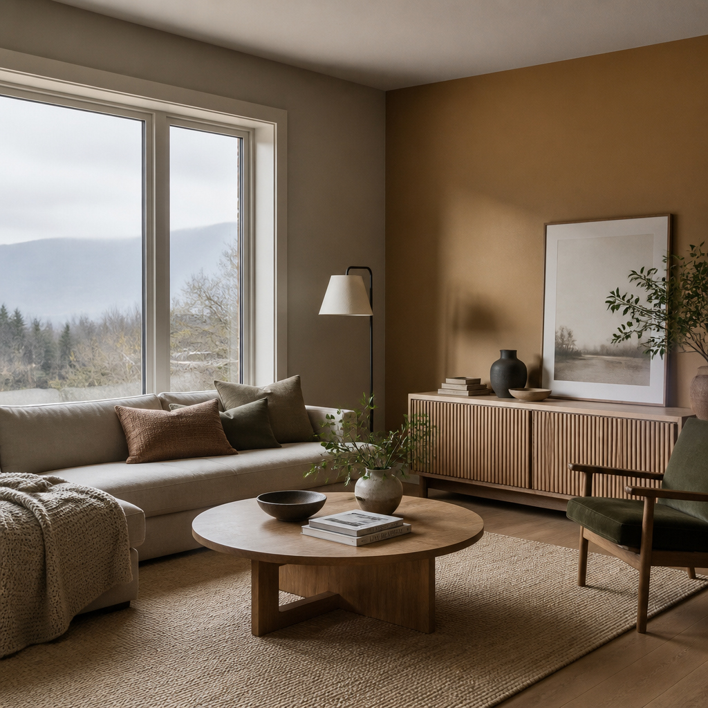
If you have ever painted a room, lived with the result for a year, and quietly regretted it, you are not alone. Choosing the wrong interior paint colours 2026 is one of the most common and costly mistakes Fraser Valley homeowners make, not because paint is cheap to buy, but because it is expensive to redo. Across Abbotsford, Langley, Surrey, and the broader Lower Mainland, a clear shift is underway: the cool greys and stark whites that defined the last decade are giving way to warmer, more grounded palettes that actually work with the specific quality of light in this region. This guide covers exactly what is trending, what to avoid, and how to get it right the first time.
Table of Contents
- Quick Takeaways
- Why Fraser Valley Light Changes Everything
- The Dominant Colour Families for 2026
- Room-by-Room Colour Recommendations
- Colour Strategy Comparison
- How to Test Colours Before You Commit
- Working with a Professional Painter
- Frequently Asked Questions
- References
Quick Takeaways
| Key Insight | Explanation |
|---|---|
| Warm undertones outperform cool ones in the Fraser Valley | The diffused, overcast-heavy light in this region punishes colours with blue or cool undertones. Warm yellows, tans, and earthy greens hold up far better year-round. |
| Earth tones are the defining palette of 2026 | Major paint manufacturers including Benjamin Moore and Sherwin-Williams have converged on warm, grounded hues: deep charcoal-browns, earthy khakis, smoky blue-greens, and warm eucalyptus greens. |
| North-facing rooms need the warmest colours on the palette | Without direct sunlight, a cool-leaning colour in a north-facing room will look flat and heavy. Choose colours with clearly warm undertones in these spaces, no exceptions. |
| The grey era is over for Fraser Valley interiors | Cool, blue-based greys that dominated BC homes from roughly 2015 to 2023 now read as dated. If your walls are still that colour, an update will have an immediate visual impact. |
| Open-plan homes need a cohesive undertone strategy | A common mistake is choosing the same colour throughout without accounting for how dramatically light shifts across different areas of an open floor plan. |
| Colour drenching is gaining real traction | Painting walls, trim, and ceiling the same colour or closely related tones creates a cohesive, enveloping effect. It works especially well with deep greens and warm charcoals. |
| Low-VOC paints are now the sensible default | Better health outcomes and improved moisture resistance make low-VOC formulations the practical choice for Fraser Valley homes, not just an ethical one. |
Why Fraser Valley Light Changes Everything
Most colour guides written for a national audience ignore the single most important factor for getting paint trends Fraser Valley right: the specific quality of daylight here. The Fraser Valley sits in a geography that produces diffused, often overcast light for a significant portion of the year. That diffusion has a direct effect on how paint colours read on your walls.
Colours with cool or blue undertones absorb diffused light rather than reflecting it, which makes them look heavier and muddier indoors than they appear on a paint chip or in a magazine photographed in a sunnier climate. This is why so many homeowners in Abbotsford, Langley, and Surrey end up with a grey that looks perfectly balanced in-store but reads cold and dingy on their walls. The fix is not just choosing a warmer grey. It is shifting your entire approach to undertones.
The light in the Fraser Valley does not behave like light in Southern California or even Toronto. What looks warm under studio lighting can look lifeless on a north-facing wall in Langley in November. Undertone awareness is not optional here, it is the foundation of every good colour decision.
North-Facing vs. South-Facing Rooms
South-facing rooms in Fraser Valley homes receive the most consistent warm light throughout the day. This gives you more flexibility with slightly cooler or mid-tone colours, because the sunlight provides natural warmth. North-facing rooms, by contrast, never receive direct sunlight to balance out a cool-leaning hue. These spaces need colours with clearly warm undertones, a warm greige, a soft clay, a muted sage green, not anything that reads grey-blue or cool violet.
Open-concept main floors present their own challenge. The light shifts dramatically from one end of the floor plan to the other, and a single colour choice that works brilliantly in one area can look wrong just fifteen feet away. Professional colour consultation, before any paint goes on the wall, solves this problem efficiently.
The Dominant Colour Families for 2026
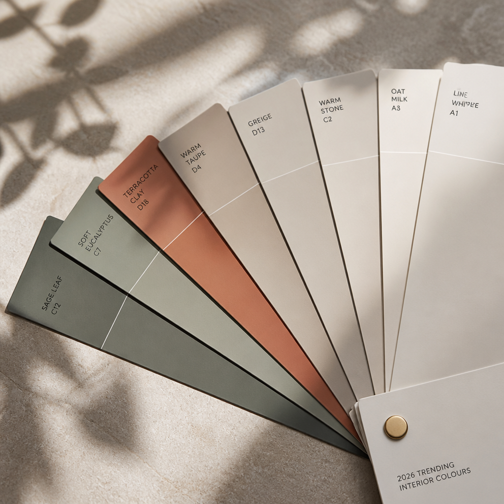
The 2026 interior paint colour landscape has been shaped by a clear consensus among major paint manufacturers. Across Benjamin Moore, Sherwin-Williams, Behr, and Valspar, the direction is the same: move away from cold minimalism and toward warm, nature-connected palettes with real depth. For Fraser Valley homeowners, this consensus aligns well with what actually works in local conditions.
Warm Neutrals and Earthy Khakis
Sherwin-Williams chose Universal Khaki (SW 6150) as its 2026 Colour of the Year. It is an earthy mid-tone tan with a warm yellow undertone that performs exceptionally well under diffused BC light. It is versatile enough for main living areas, hallways, and even bedrooms without ever looking flat. For Fraser Valley homes with larger floor plans and mixed natural light, this is a highly practical anchor colour.
Greige, the grey-beige blend that has been popular for years, remains relevant in 2026 but has evolved. The versions gaining traction now have more beige warmth than in previous years, leaning toward stone and sand rather than the blue-grey greiges common between 2019 and 2022. If you want a neutral that does not read as dated, the warmer side of the greige spectrum is where to land.
Deep Charcoal-Browns and Moody Anchors
Benjamin Moore’s 2026 Colour of the Year, Silhouette (AF-655), is a rich espresso brown with charcoal undertones. It is a bold, enveloping colour designed for accent walls, feature spaces, and dramatic entryways. In south-facing rooms with good natural light, it reads as warm and luxurious. In north-facing rooms, it takes on a cooler, more mysterious tone, which can work well in a primary bedroom or library if that is the atmosphere you are after.
This colour family suits Fraser Valley homes with traditional or transitional architecture, particularly those with wood flooring, natural stone, and warm metallic fixtures. Paired with crisp warm whites on trim and millwork, the contrast is striking without being harsh.
Smoky Blue-Greens and Muted Sage
Behr’s 2026 Colour of the Year, Hidden Gem (N430-6A), is a smoky jade blue-green that acts almost as a neutral because it blends naturally with so many other hues. Valspar’s Warm Eucalyptus (8004-28F) covers similar territory with a softer, grayer green that reads as calming and organic. Both colours work well in bedrooms and bathrooms where a spa-like quality is the goal.
The key caution for Fraser Valley homeowners: blue-greens in north-facing rooms can read cooler than intended. In these spaces, lean toward the more yellow-green end of the sage spectrum rather than the blue-green end. In south-facing rooms with good light, either direction works well.
Pro tip: Before committing to any colour from the 2026 trend palette, paint a large swatch directly on your wall, at least 30 cm by 30 cm, and observe it at different times of day including morning, midday, and evening with artificial lighting. Colour chips at the store are viewed under controlled retail lighting that is nothing like the light in your home.
Room-by-Room Colour Recommendations
Generic colour trends need to be translated into room-specific decisions. The best colour for your living room is not automatically the best colour for your kitchen or primary bedroom. Each space has different functional requirements, different light conditions, and different furniture and flooring contexts.
Living Rooms and Open-Plan Main Floors
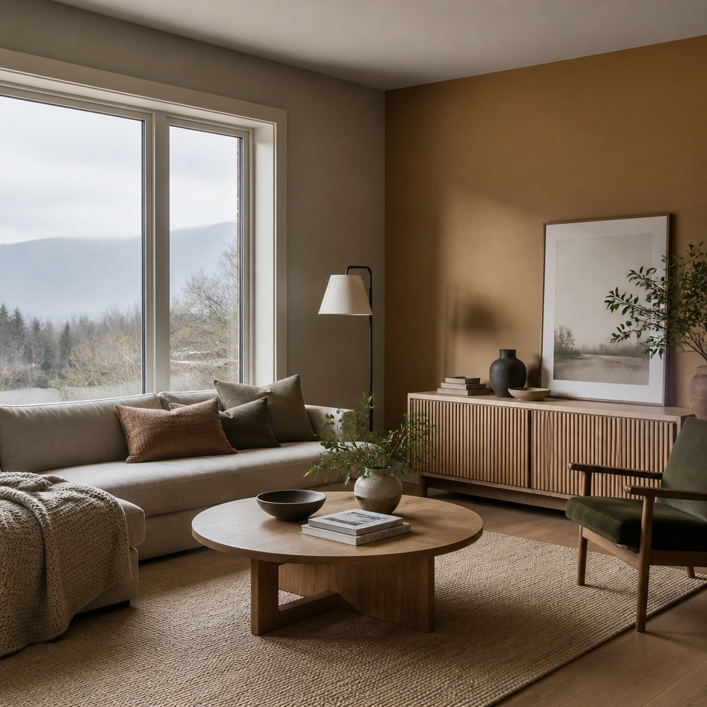
For large, open-concept main floors, warm neutrals are the right call in 2026. They read as fresh without being trend-dependent, and they give furniture, flooring, and textiles room to breathe. Colours in the warm greige, soft clay, and sandy tan range are performing consistently well in Fraser Valley homes right now. Deep terracotta and earthy green work as accent choices in living rooms where a bolder statement is the goal.
Primary Bedrooms
Deep greens and slate blues are gaining significant ground in primary bedrooms across Langley, Surrey, and Abbotsford. The goal is a space that feels intentional and calm rather than neutral-by-default. Muted sage greens with warm undertones are the most accessible entry point. For homeowners willing to go bolder, a colour like Silhouette on a feature wall behind the bed creates a genuinely sophisticated result, particularly when paired with warm wood tones and linen textiles.
Kitchens and Cabinetry
Warm whites and sage greens are dominating kitchen cabinetry in 2026. If your kitchen has existing white or off-white cabinetry, you likely do not need to replace it. A cabinet refinishing service can transform the colour and finish at a fraction of the cost of full replacement. For those refreshing both walls and cabinetry, the combination of a warm wall neutral with a contrasting cabinet colour in deep green or navy continues to be a strong performing choice in cabinet refinishing projects across the Lower Mainland.
Dining Rooms
Dining rooms are the space where homeowners are most willing to go bold in 2026, and for good reason. These rooms are used primarily in the evening under artificial light, which means the diffused-light concerns that apply to other spaces matter less here. Deep terracotta, warm burgundy-browns, and rich jewel tones all perform beautifully in dining rooms under warm artificial lighting.
Colour Strategy Comparison
Not every homeowner comes to a interior painting project with the same goal. Some want a complete colour overhaul. Others want to update a single room or feature wall. Some are preparing a home for sale and need broad appeal. The table below compares three approaches that professional painters in BC are seeing most frequently right now.
| Approach | Best For | Key Colour Direction in 2026 |
|---|---|---|
| Full Whole-Home Repaint | Homeowners wanting a complete visual refresh or those moving into a new property with dated colours | Warm neutral base (greige, sandy tan) throughout main living areas, with deeper accent colours in bedrooms and dining rooms. Cohesive undertone strategy across the entire floor plan. |
| Feature Wall or Accent Strategy | Homeowners who want a colour update without committing to full-room changes, or those on a tighter budget | Bold anchors like Silhouette (charcoal-brown) or Hidden Gem (smoky teal) on a single feature wall, keeping adjacent walls in a warm off-white or light neutral. High visual impact, lower cost. |
| Pre-Sale Refresh | Homeowners preparing a property for market who need broad buyer appeal | Warm off-whites and light greiges throughout. Avoid bold accent colours in favour of universally appealing, move-in-ready neutrals. Crisp trim in warm white to signal cleanliness and care. |
How to Test Colours Before You Commit
Colour testing is the most underused step in any interior painting project, and skipping it is consistently where homeowners run into trouble. A paint chip at the store is about the size of a business card, viewed under controlled retail lighting. Your wall is several square metres, viewed under your home’s specific mix of natural and artificial light. The two are not comparable.
The standard professional approach is to paint large test swatches directly on the wall, not on paper or card pinned to the wall. Paint on paper behaves differently from paint on a primed wall surface, and the gap around the paper creates an optical effect that distorts your perception of the colour. Paint directly on the wall, observe it for at least 48 hours across different lighting conditions, and then make your decision.
For residential painting Langley and broader Fraser Valley projects, it is also worth testing colours in the specific rooms where they will be used, not just in one test room and then assuming the result will translate. A colour that looks warm and inviting in your south-facing kitchen may look entirely different in your north-facing study.
Pro tip: When choosing between two similar colours, always go with the warmer one for north-facing rooms in the Fraser Valley. The difference that looks subtle on a chip will amplify once the colour is on all four walls and the door is closed.
Working with a Professional Painter
Colour selection is one part of a successful interior painting project. Execution is the other, and the two are more connected than most homeowners realize. The best colour choice in the world will look mediocre if the surface preparation is inadequate, the primer is wrong for the substrate, or the finish is applied inconsistently. These are not hypothetical concerns. They are the most common sources of disappointment on DIY and low-bid painting projects across the Fraser Valley.
What Surface Preparation Actually Involves
Proper surface preparation for an interior repaint includes filling and sanding all imperfections, spot-priming repaired areas, and in many cases priming the entire surface if the existing colour is dramatically different from the new one. Skipping or rushing this step produces a result that shows every imperfection through the new paint, particularly with darker or more saturated 2026 trend colours that are less forgiving than light neutrals.
Choosing the Right Sheen
Sheen level affects both the appearance and durability of the final result. Flat and matte finishes are popular for ceilings and feature walls because they absorb light and minimize surface imperfections. Eggshell and satin finishes are the practical choice for most living areas and bedrooms. Semi-gloss is appropriate for trim, doors, and kitchens where washability matters. Applying the wrong sheen in a high-traffic area is a mistake that shows up quickly with young children or pets in the home.
At Dreamscape Painting Ltd., our estimators walk through these decisions with homeowners before a single drop of paint is applied. After more than 35 years serving the Lower Mainland, we have seen every combination of light condition, architecture, and lifestyle requirement across Abbotsford, Langley, Surrey, and the broader Fraser Valley. That experience translates directly into colour recommendations that work in your specific home, not just in theory.
If you are considering an interior painting project this year, the best first step is a professional on-site estimate. It costs nothing and removes the guesswork from what can otherwise be an expensive trial-and-error process. Our team also offers guidance on cabinet refinishing for homeowners who want to update their kitchen without a full renovation.
Frequently Asked Questions
What are the most popular interior paint colours for Fraser Valley homes in 2026?
The strongest performing interior paint colours for Fraser Valley homes in 2026 fall into three families: warm neutrals in the greige, sandy tan, and soft clay range for main living areas; deep greens and slate blues for primary bedrooms and feature spaces; and warm whites or sage greens for kitchen cabinetry. These align with both the 2026 direction from major manufacturers and the specific natural light conditions common in Abbotsford, Langley, and Surrey. For kitchens, see cabinet painting in Langley and cabinet refinishing in Surrey.
Why do cool greys look wrong in so many Fraser Valley homes?
The Fraser Valley receives a significant amount of diffused, overcast light throughout the year. Colours with cool or blue undertones absorb this diffused light rather than reflecting it, which makes them appear heavier and muddier than they looked on the paint chip. This is why a cool grey that looks balanced in-store ends up looking cold and dingy on a north-facing wall in Langley or Abbotsford. Shifting to colours with warm yellow, beige, or earthy undertones solves this problem directly.
Is colour drenching a passing trend or something worth doing in 2026?
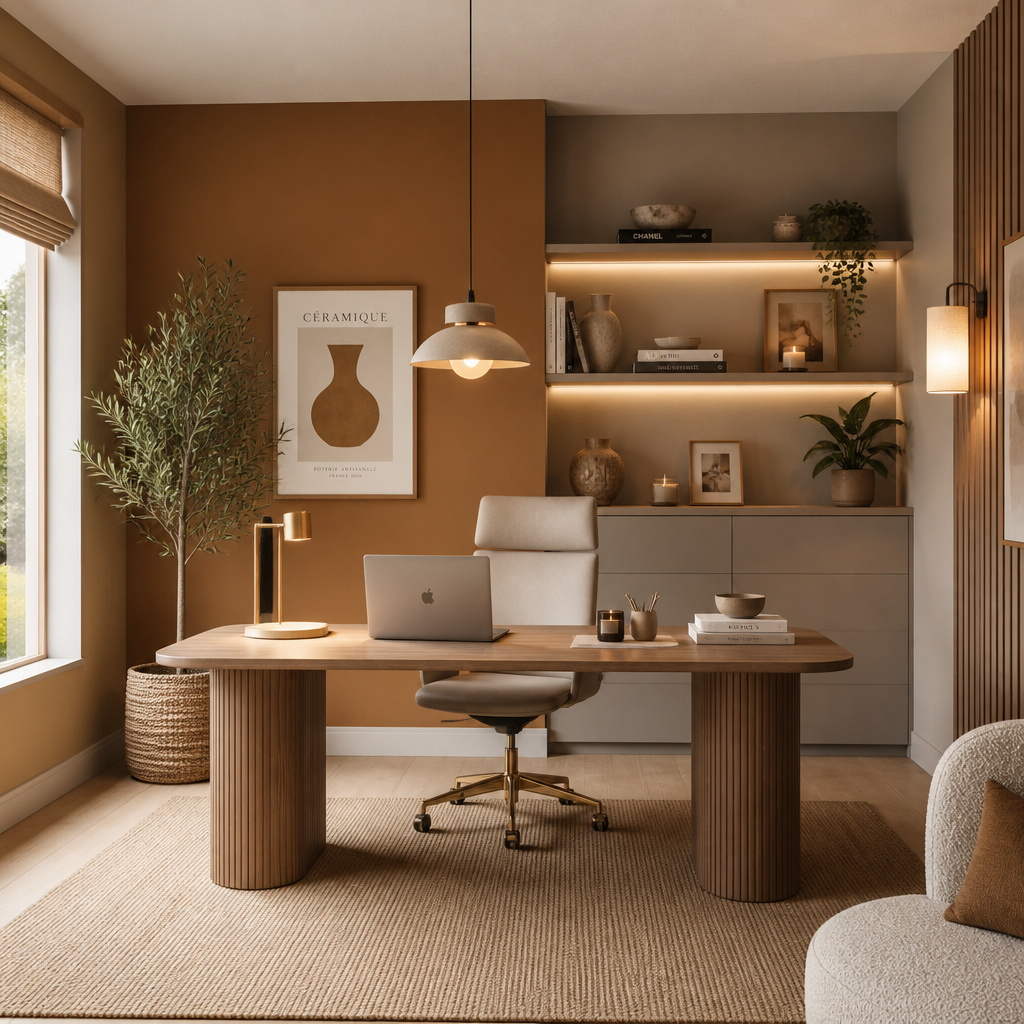
Colour drenching, painting walls, trim, ceiling, and architectural details in the same colour or closely related tones, is not new, but it has gained considerable momentum heading into 2026. It works particularly well with deep greens and warm charcoals, and it creates a sense of intentional, considered design that single-feature-wall approaches cannot match. It is a worthwhile approach for dining rooms, primary bedrooms, and home offices where a more immersive atmosphere is the goal.
Should I use low-VOC paint for my interior painting project?
Yes, and not just for health reasons. Low-VOC paint formulations have improved significantly, and many now offer better moisture resistance than older conventional formulas. This matters in Fraser Valley homes where humidity can be a factor. Low-VOC options reduce odour during application, which is particularly important in homes with children, pets, or individuals with respiratory sensitivities. They are now the standard at professional painting companies serving the Lower Mainland, and the quality difference compared to conventional paints has largely closed.
How do I choose between a whole-home repaint and a feature wall approach?
If your existing wall colours have warm, neutral undertones that are in good condition, a targeted feature wall approach using one of the bolder 2026 trend colours can deliver significant visual impact at lower cost. If your home still has the cool greys or blue-greige tones common in the 2015 to 2023 period, a whole-home repaint with a warm neutral base will produce a dramatically better result than any feature wall can. The right answer depends on your existing colour situation, your budget, and whether you are refreshing for personal enjoyment or preparing for sale.
How much does an interior painting project typically cost in the Fraser Valley?
Costs vary depending on the size of the space, the condition of existing surfaces, the number of colours involved, and the complexity of the trim work. A professional on-site estimate is the only reliable way to get an accurate figure for your specific home. At Dreamscape Painting Ltd., estimates are provided at no cost and include a walkthrough of colour and product recommendations, so you are not left making decisions without expert input. Attempting to budget from online averages without a site visit almost always leads to surprises.
We would love to hear what colour choices you are considering for your Fraser Valley home this year. Share your experience or questions in the comments, and our team is happy to weigh in.
We would love your feedback and any insights you would share with others. What perspective would you add?
References
- Dreamscape Painting: Interior Paint Colours for Fraser Valley Homes 2026, including light analysis and colour family recommendations specific to BC
- 2026 Paint Colours of the Year from every major manufacturer, including Benjamin Moore Silhouette, Sherwin-Williams Universal Khaki, and Behr Hidden Gem
- Professional colour consultant review of 2026 paint colour trends, including how to use earthy neutrals and moody anchors in residential spaces
- Benjamin Moore Silhouette 2026 Colour of the Year announcement and design application guide
- Interior colour consultant mid-year review of 2026 paint trends, including green, greige, and sage popularity analysis

